List
Grid
-
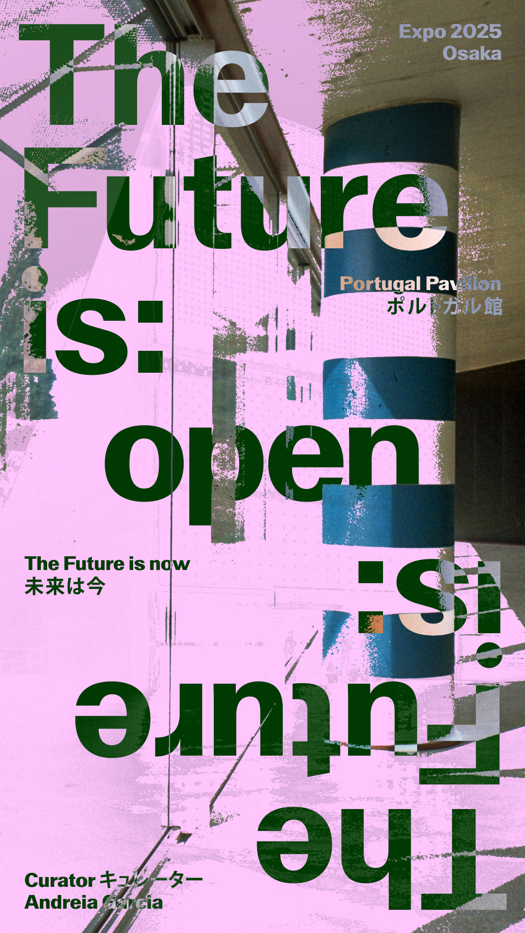
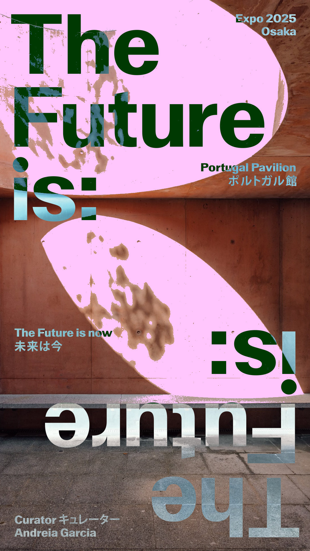
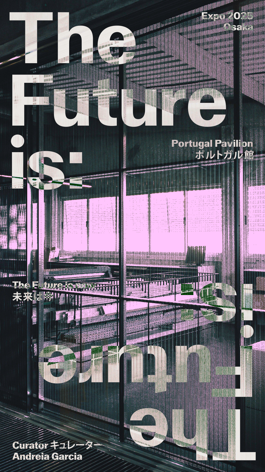
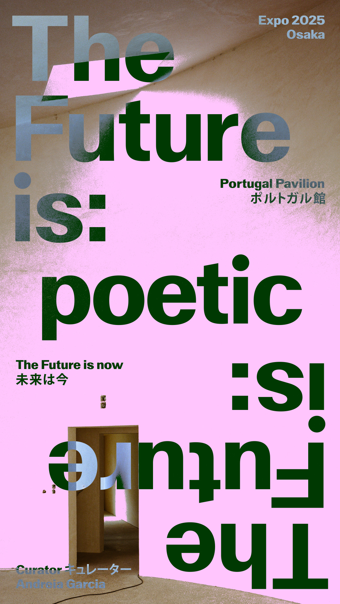
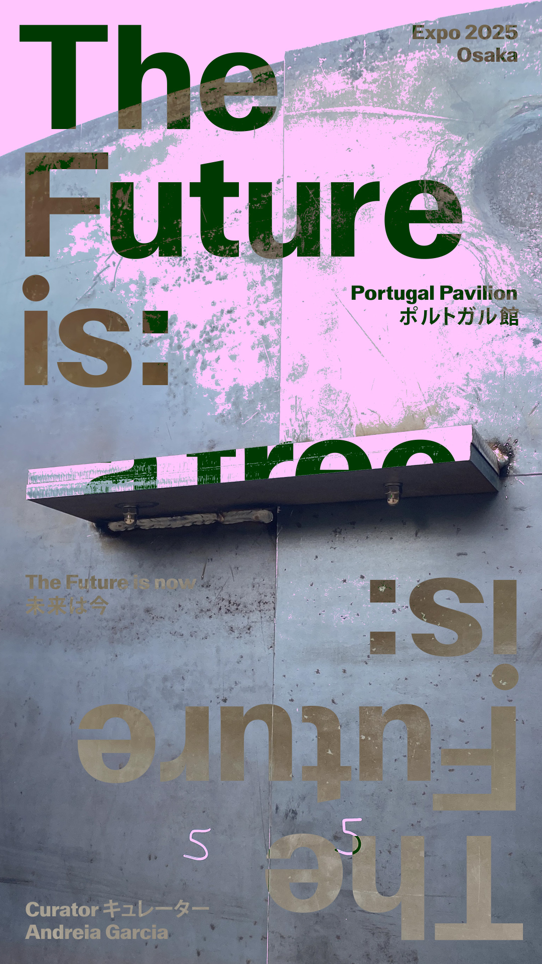
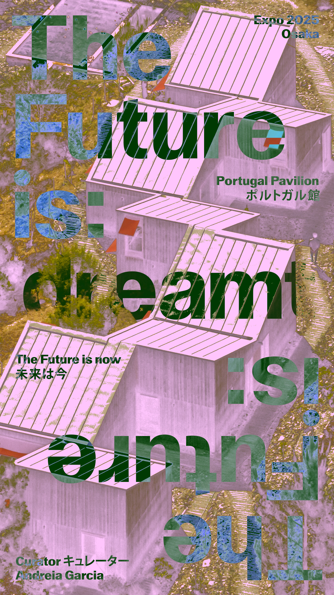
The future is now
-
 1/3
1/3 -
 2/3
2/3 -
 3/3
3/3
-
 1/3
1/3 -
 2/3
2/3 -
 3/3
3/3
- identity
- digital
-
-
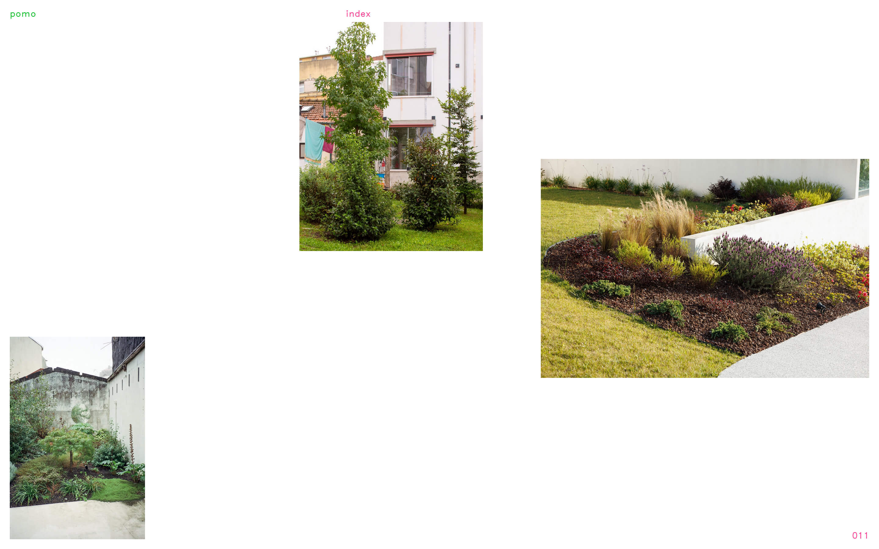
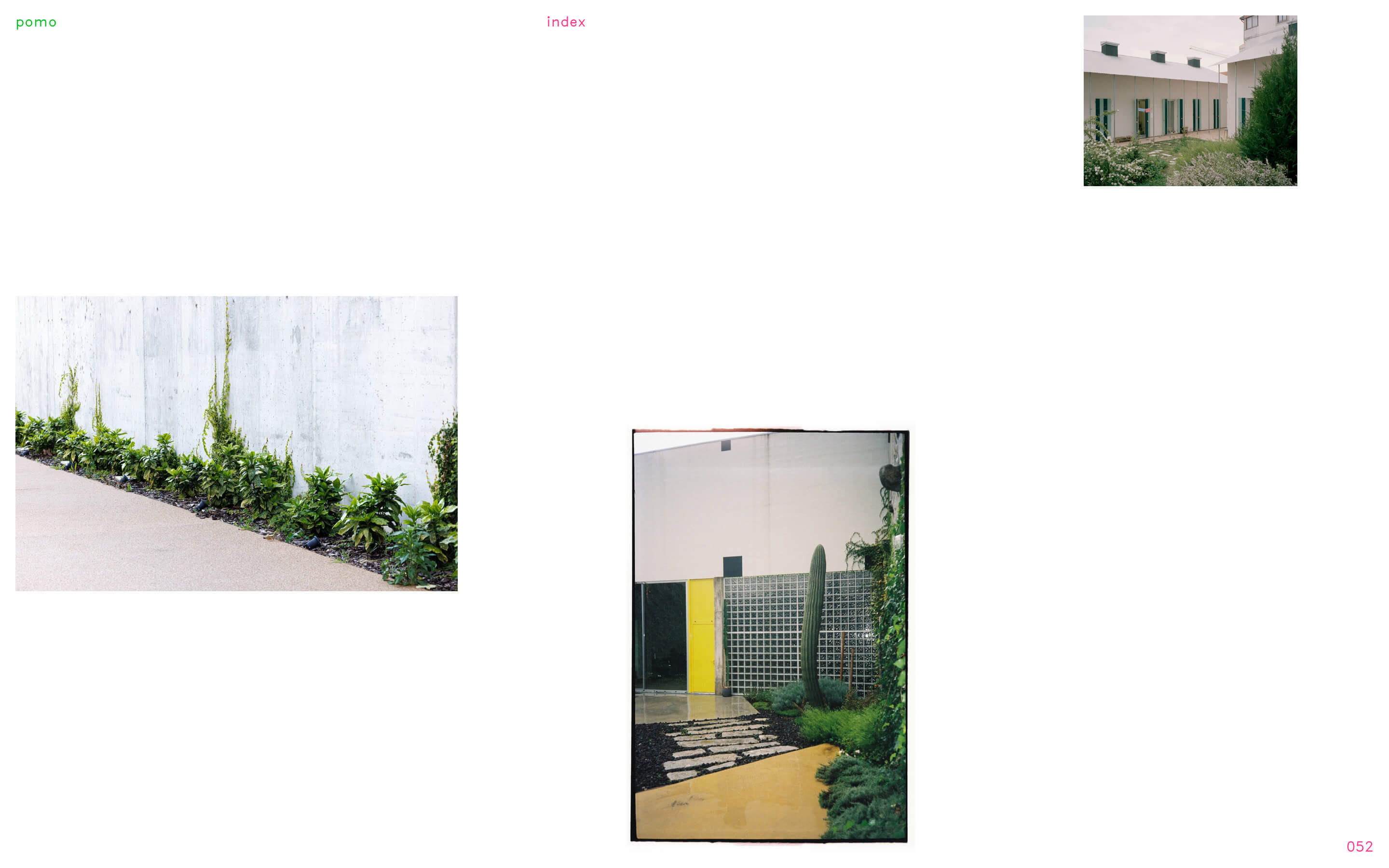
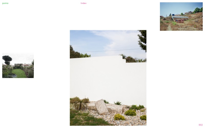
pomo.pt
-
 1/4
1/4 -
 2/4
2/4 -
 3/4
3/4 -
 4/4
4/4
- website
- identity
-
-
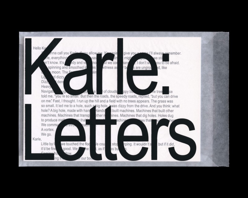
Karle: Letters
- publication
-
-
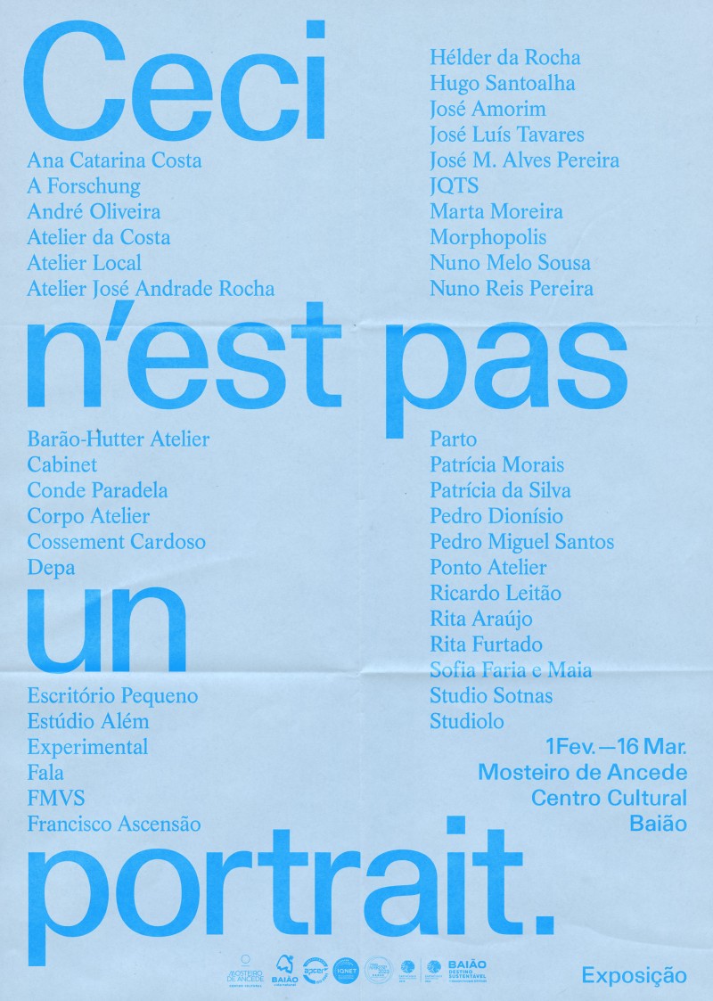
Ceci n'est pas un portrait, exhibition
- exhibition
-
-
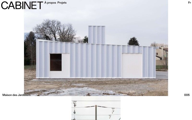
cabinet.archi
- website
-
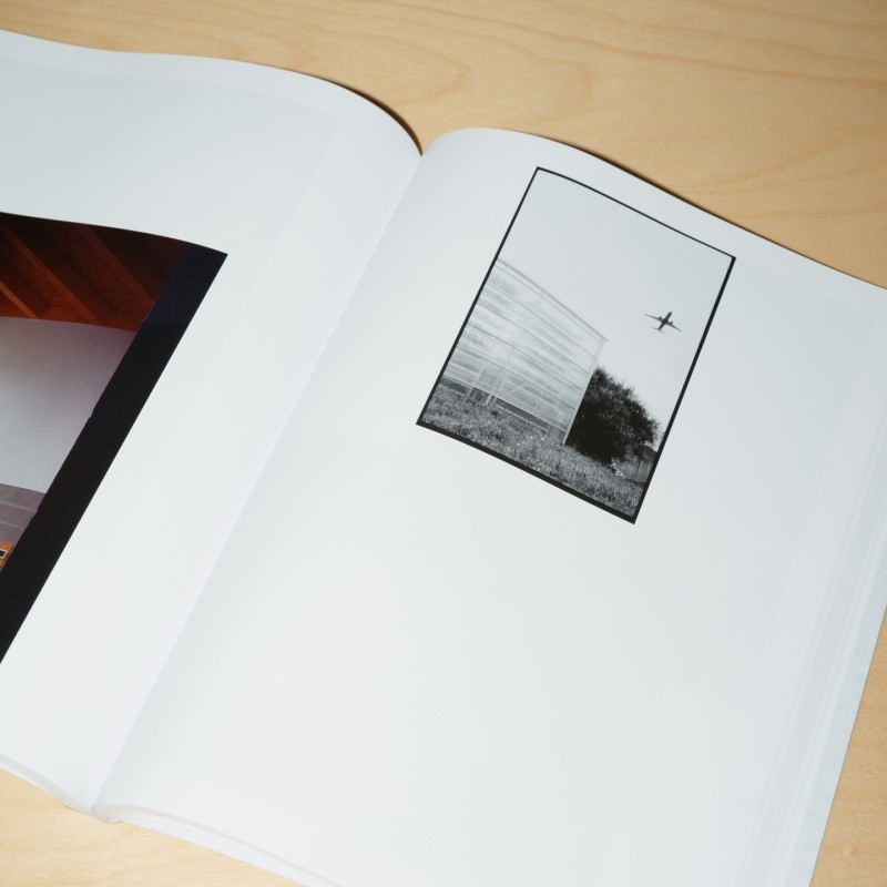
Ceci n'est pas un portrait.
- publication
-
-
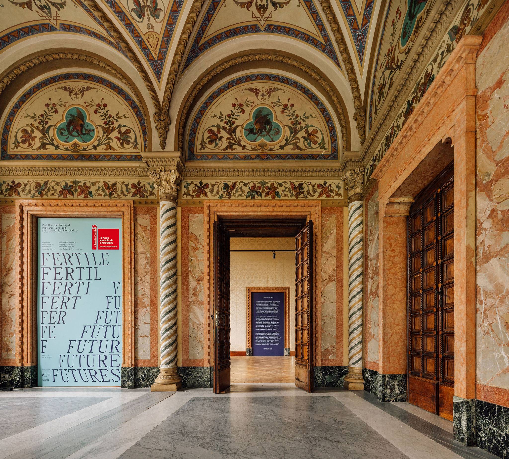
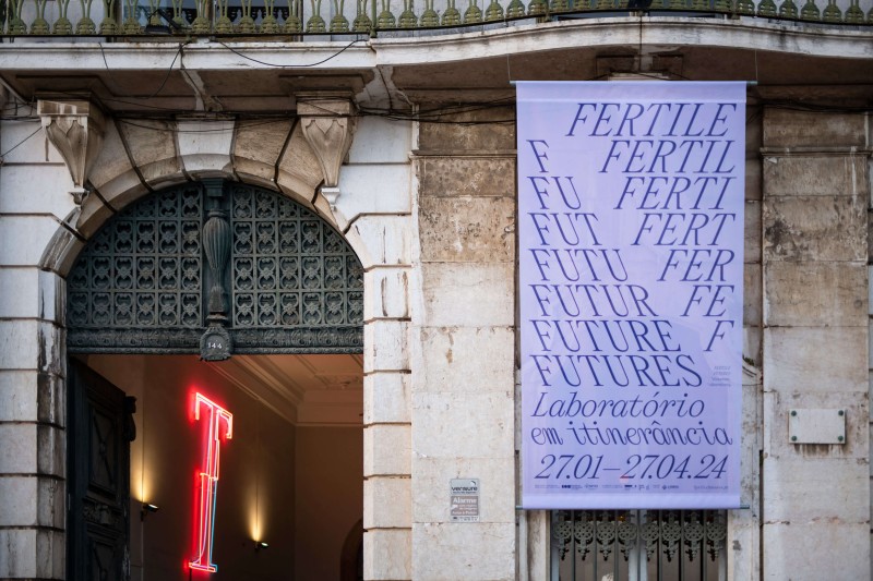
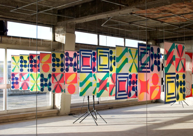
Fertile Futures: Itinerant Laboratory
- identity
- exhibition
-
-
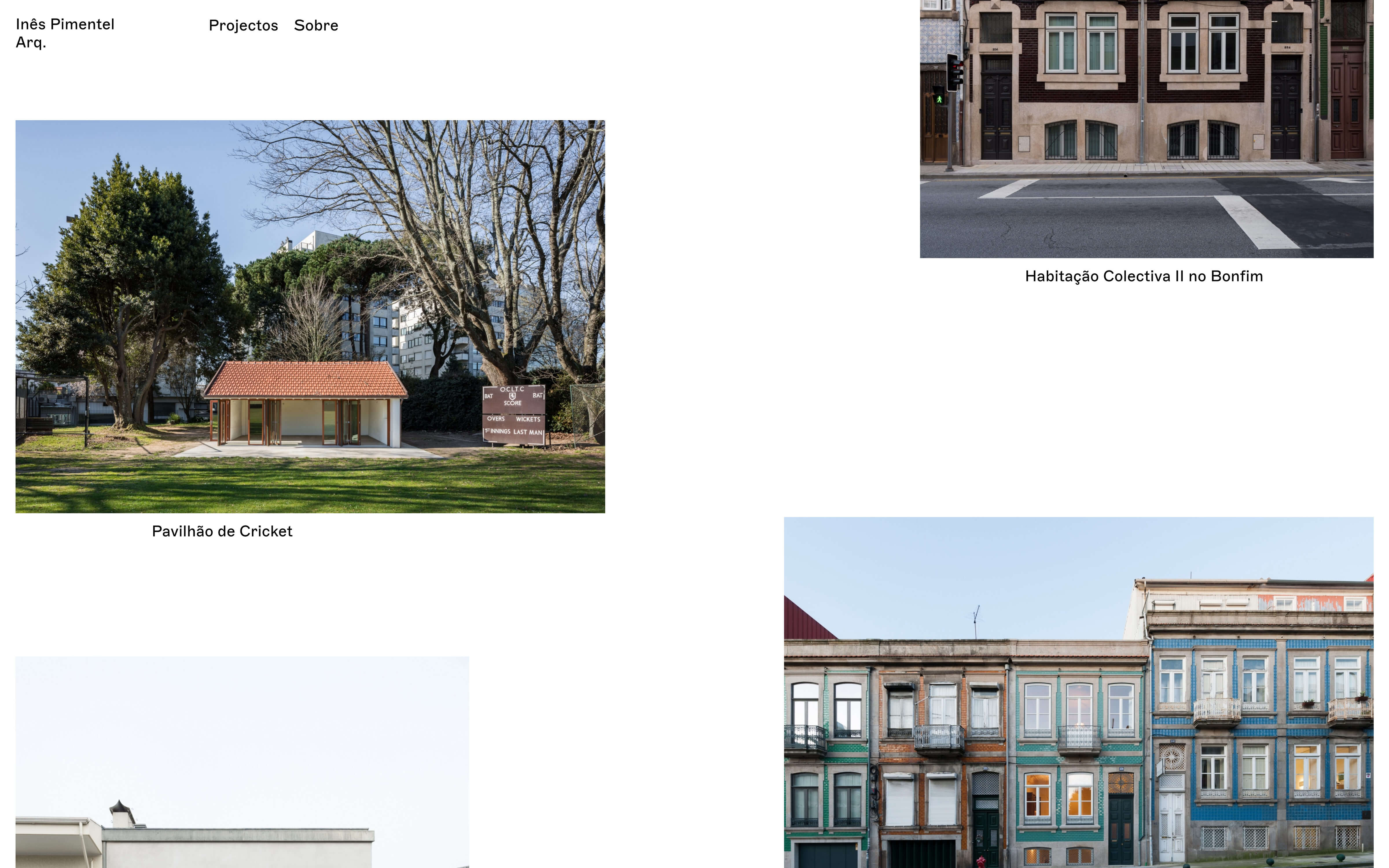
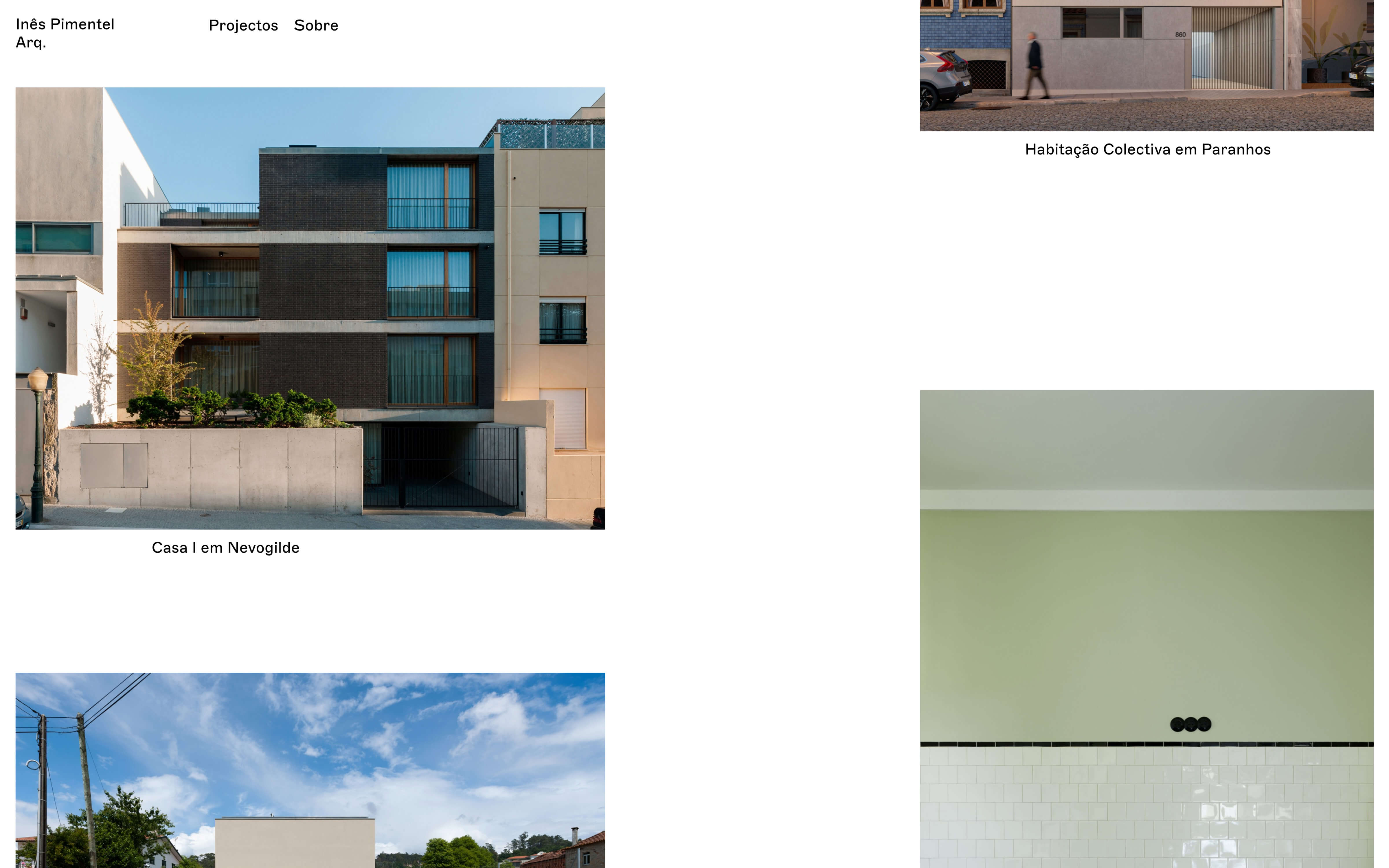
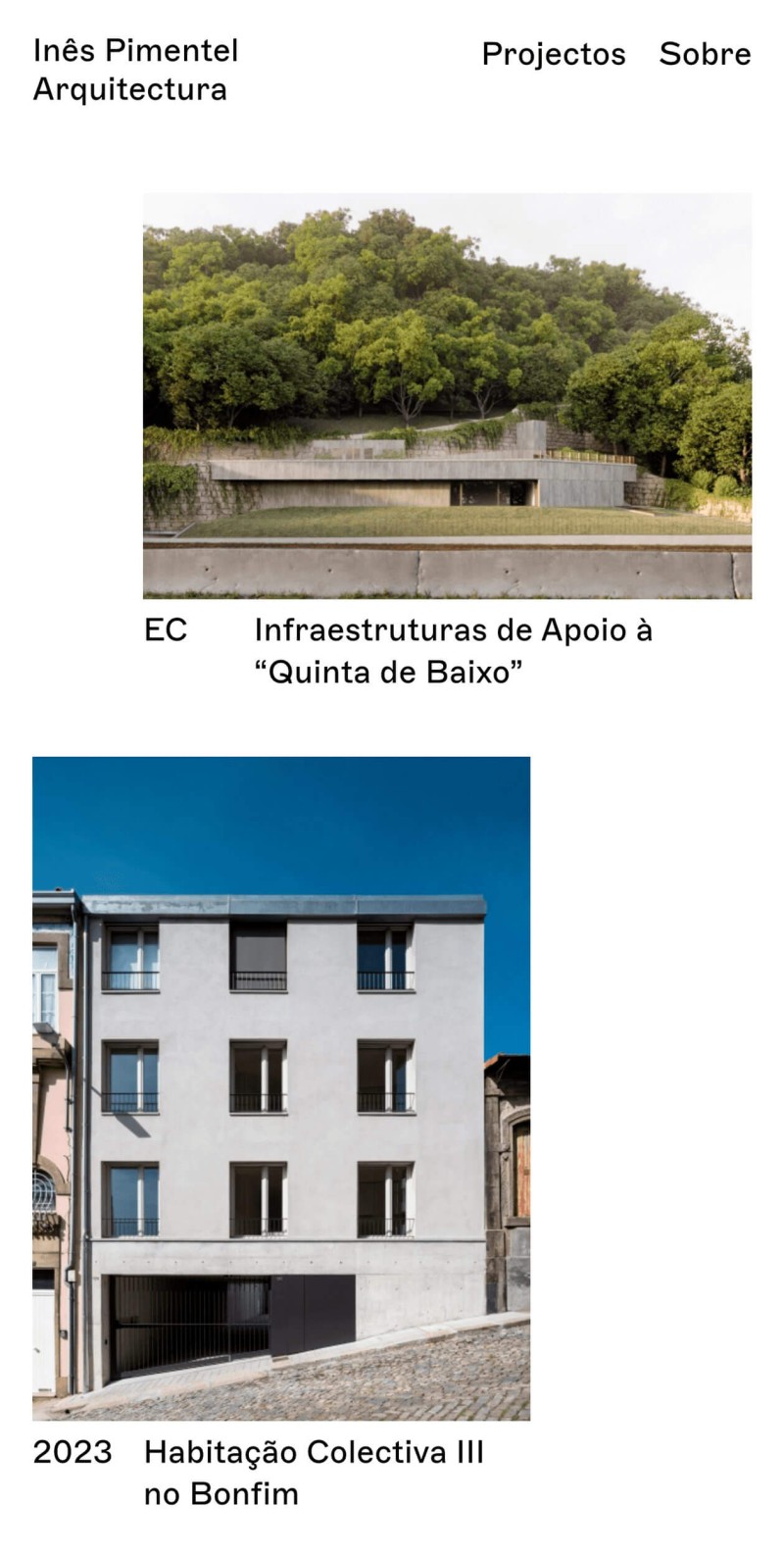
inespimentel.com
-
 1/3
1/3 -
 2/3
2/3 -
 3/3
3/3
- website
-
-
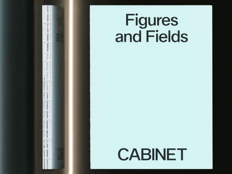
Figures and Fields
- publication
-
-
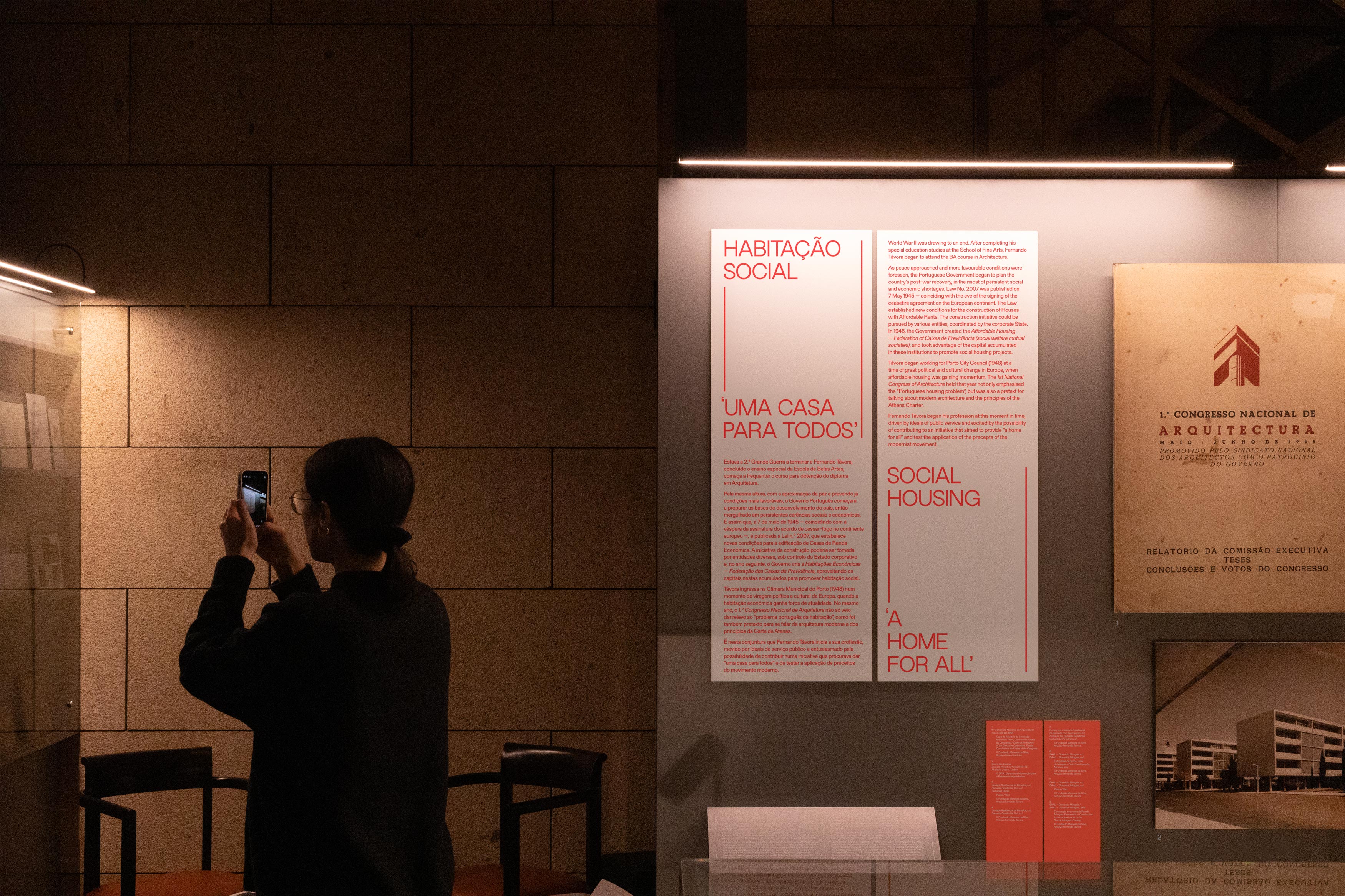
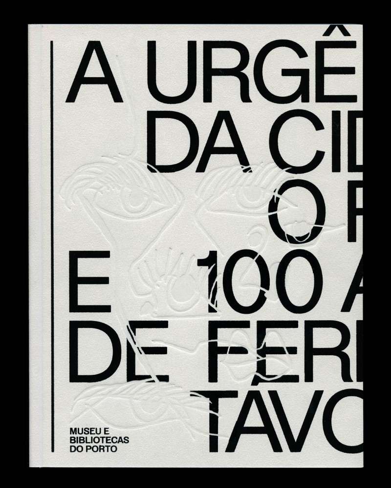
Urgência da Cidade: Fernando Távora, Book
- publication
-
-
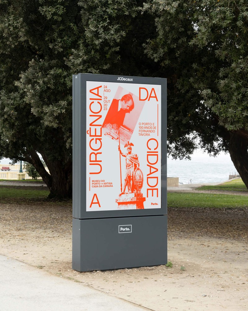
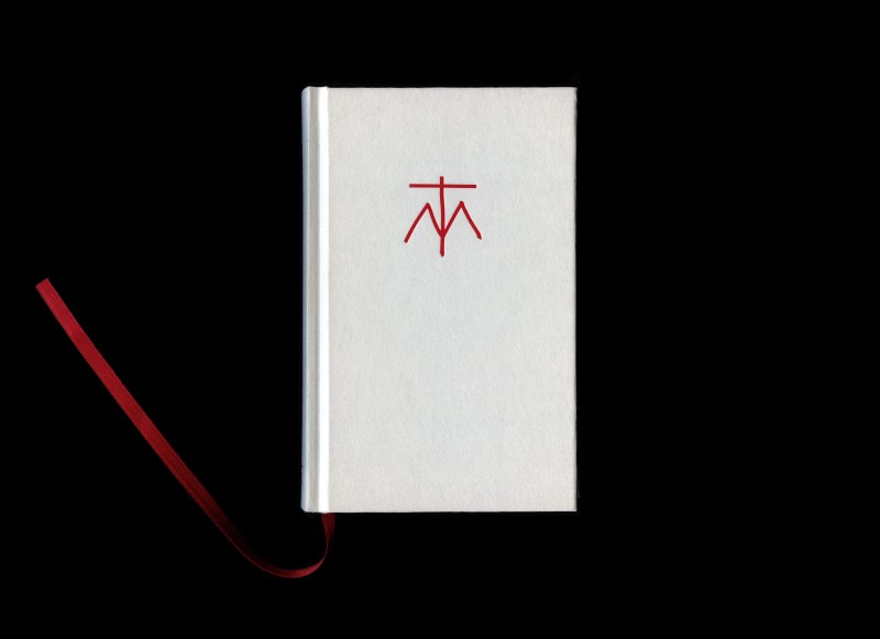
Urgência da Cidade: Fernando Távora
- identity
- exhibition
- poster
- digital
-
-
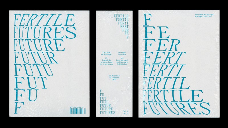
Fertile Futures Catalogue
- publication
-
-
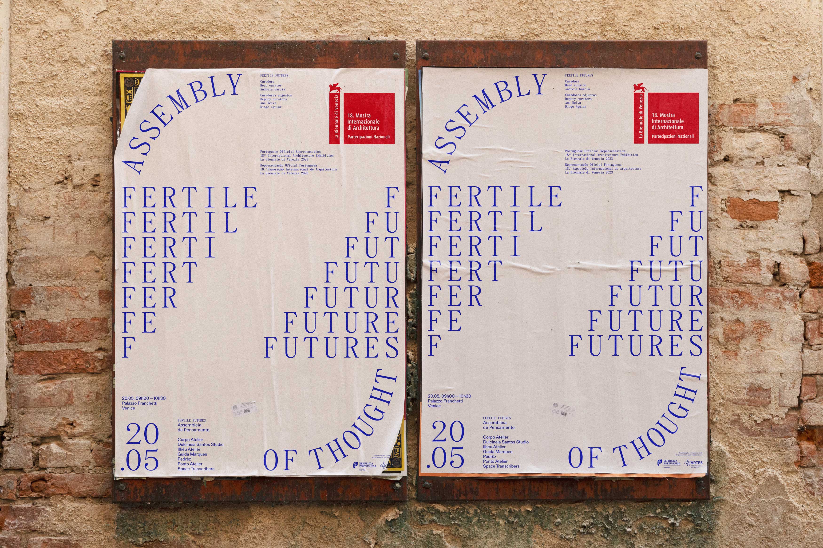
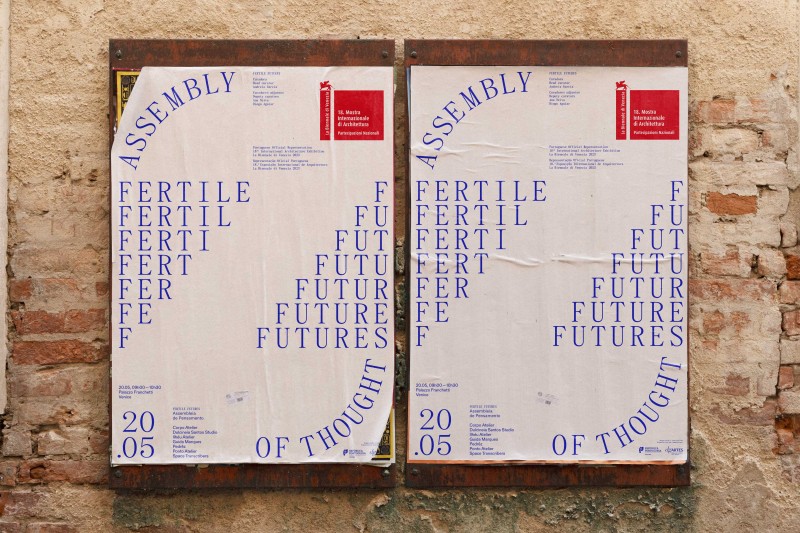
Assemblies of Thought
- identity
- poster
- digital
-
-
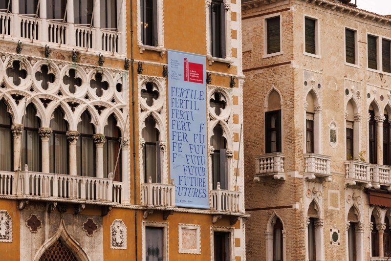
Fertile Futures
-

© Francisco Nogueira
© Francisco Nogueira - identity
- campaign
- exhibition
- poster
- digital
-
-
Novos Encontros do Cinema Português
- identity
- poster
- publication
- digital
-
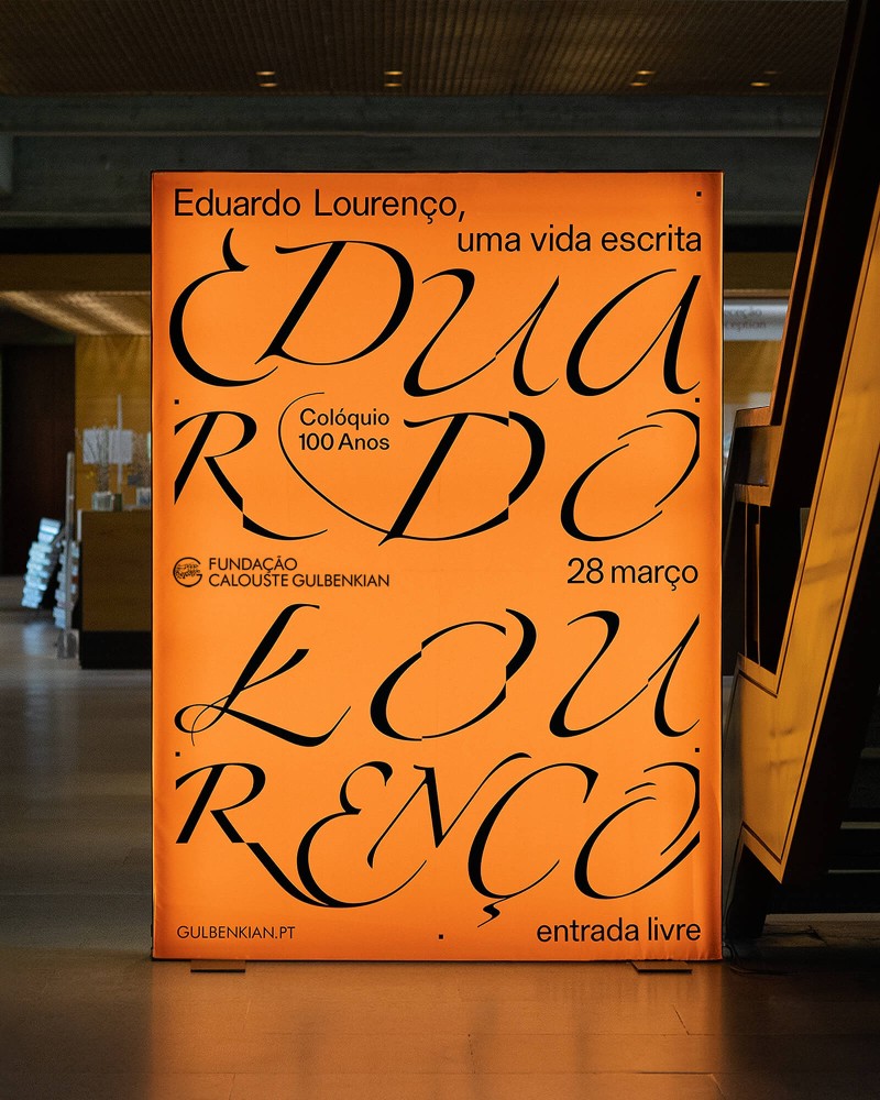
Eduardo Lourenço, uma vida escrita
- identity
- campaign
- poster
- digital
-
-
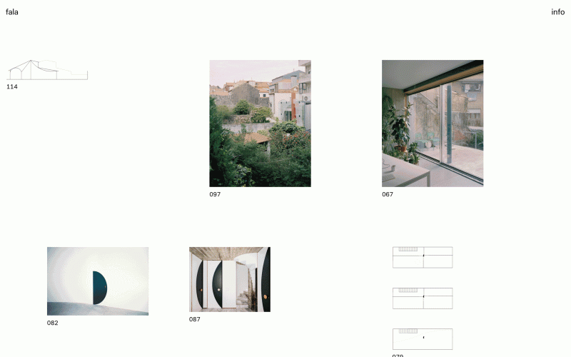
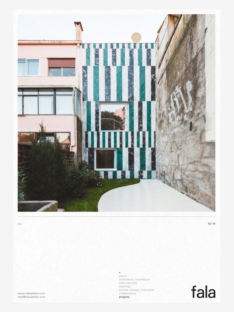
falaatelier.com
- website
-
-
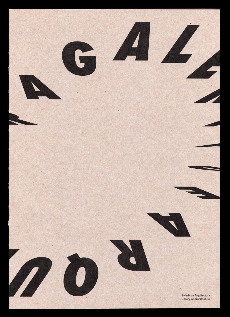
Gallery of Architecture, Book
- publication
-
-
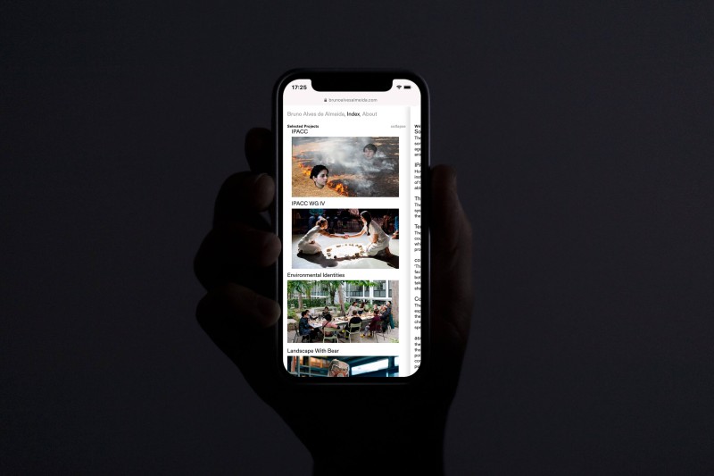
brunoalvesalmeida.com
- website
-
-
Teatro do Mal
- publication
-
-
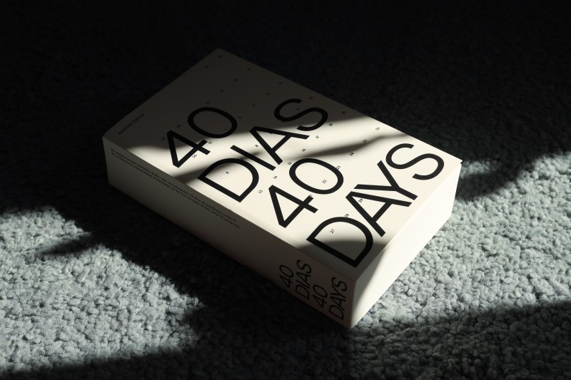
40 dias, 40 days
- publication
-
-
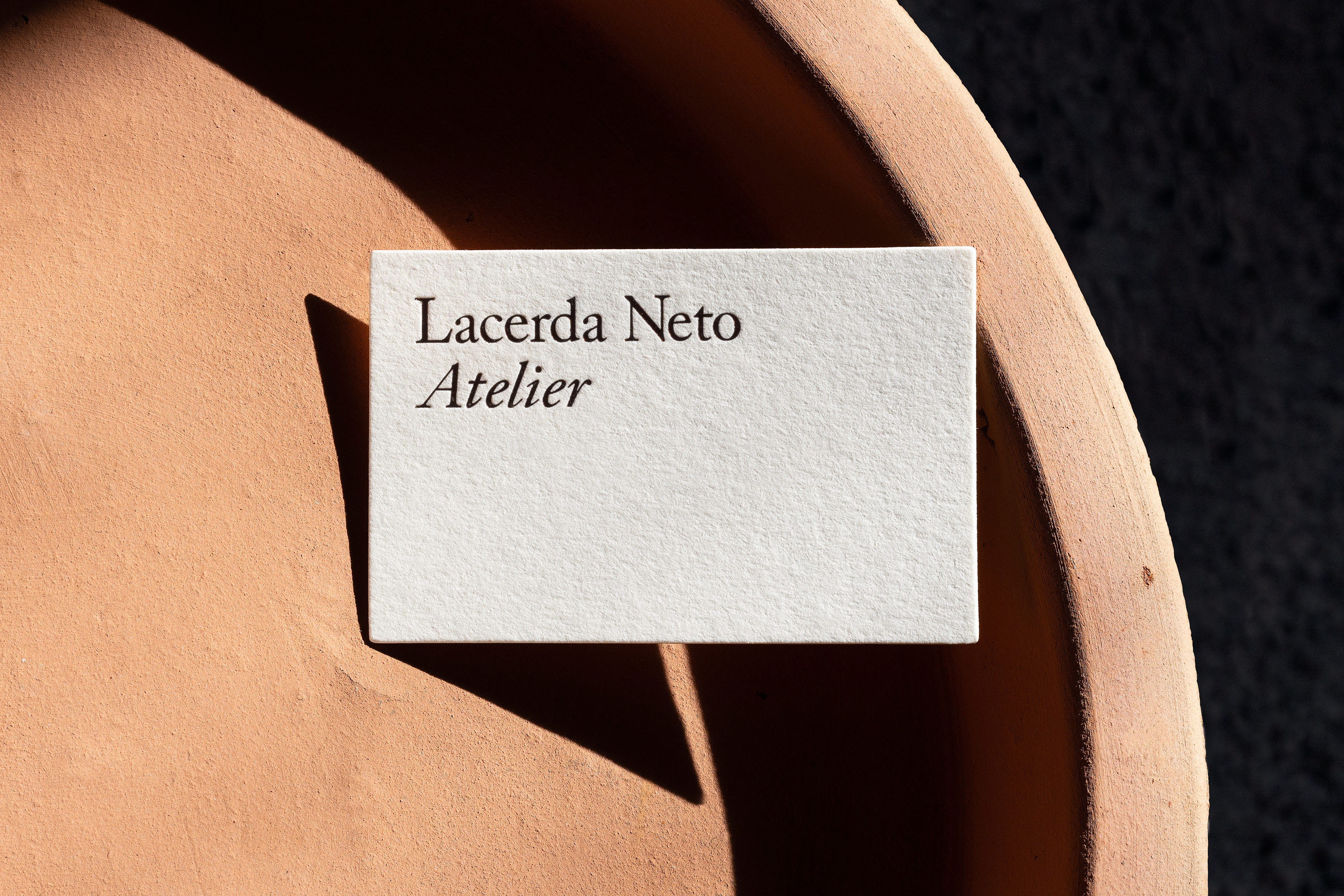
Lacerda Neto Atelier
- identity
-
-
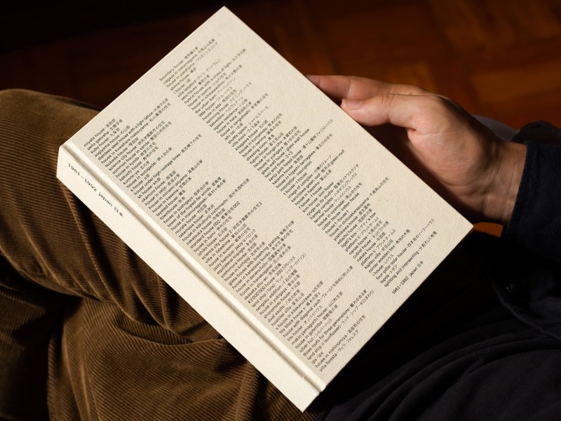
1961 – 1992 Japan
- publication
-
-
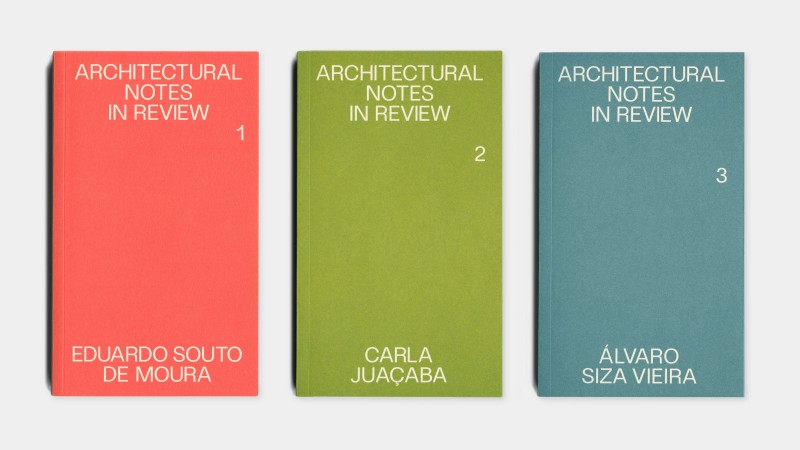
Architectural Notes in Review
- publication
-
-
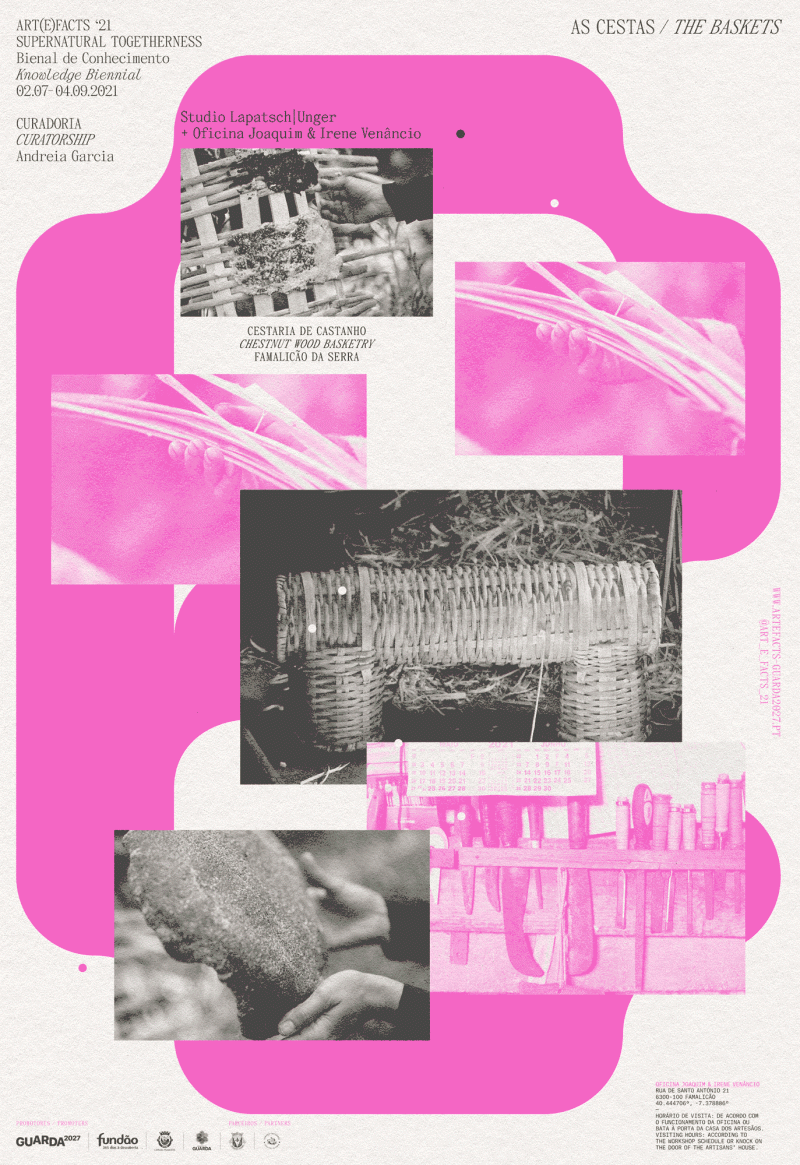
Art(e)facts 21
- identity
- campaign
- poster
- digital
-
-
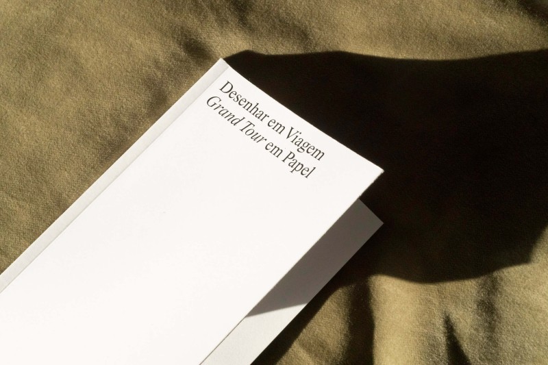
Grand Tour
- publication
-
-
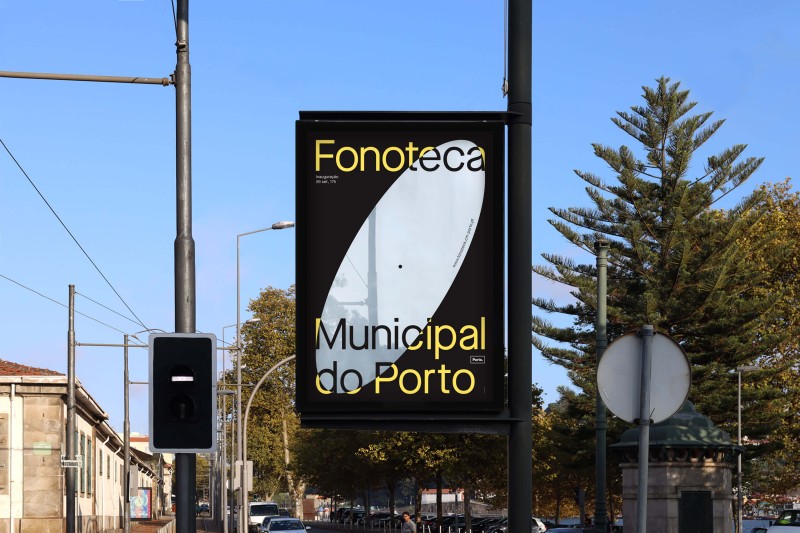
fonoteca.cm-porto.pt
- website
-
Fonoteca Municipal do Porto
- campaign
- poster
- digital
-
-
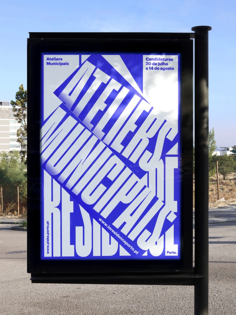
Ateliers Municipais
- website
- poster
-
-
Prémio Távora
- poster
-
-
Double Exposure
- identity
- exhibition
- poster
- digital
-
-
Shaping Shape
- publication
-
-
Filipe Pina Arquitectura
- identity
- digital
-
-
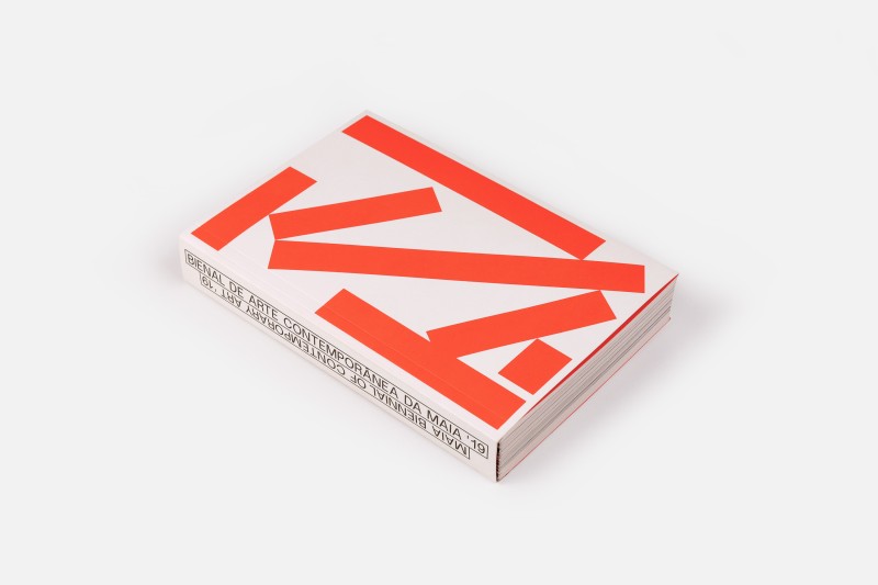
Maia Biennial of Contemporary Art '19, Book
- publication
-
-
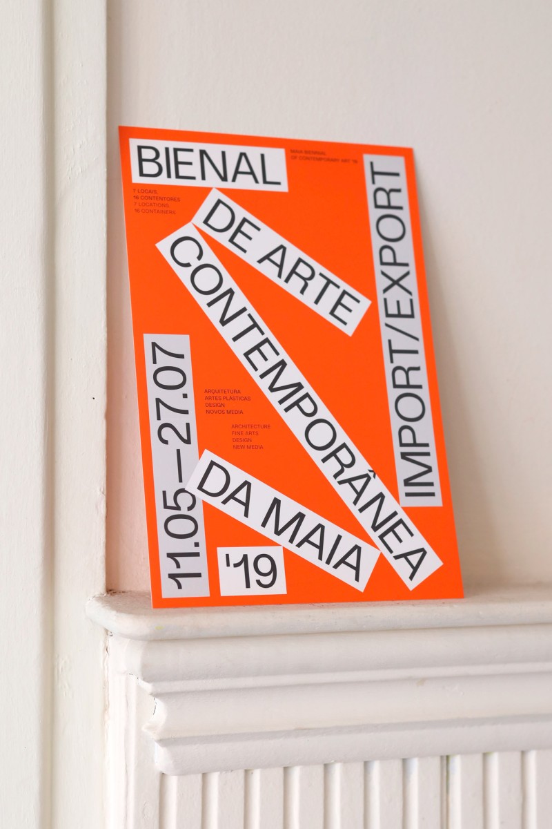
Maia Biennial of Contemporary Art '19
- identity
- campaign
- exhibition
- poster
- digital
-
-
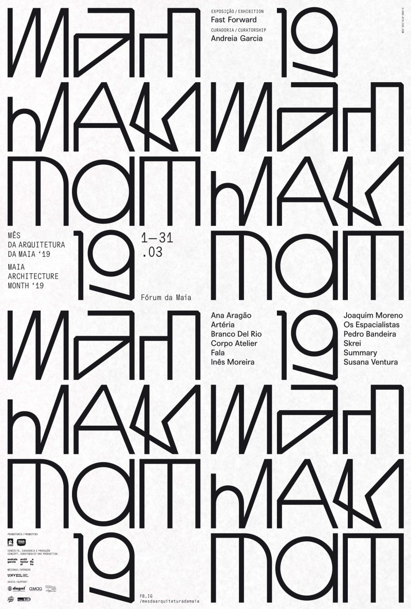
MAM '19
- identity
- campaign
- exhibition
- poster
- digital
-
-
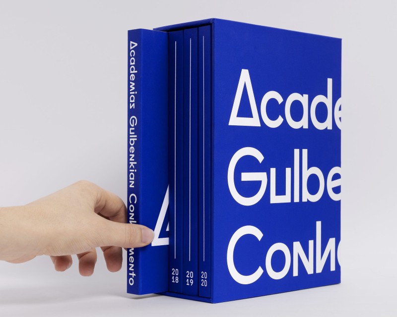
Academias Gulbenkian Conhecimento
- identity
- campaign
- publication
-
-
Os Jardins da UTAD
- publication
-
-
fala files
- digital
- typeface
-
-
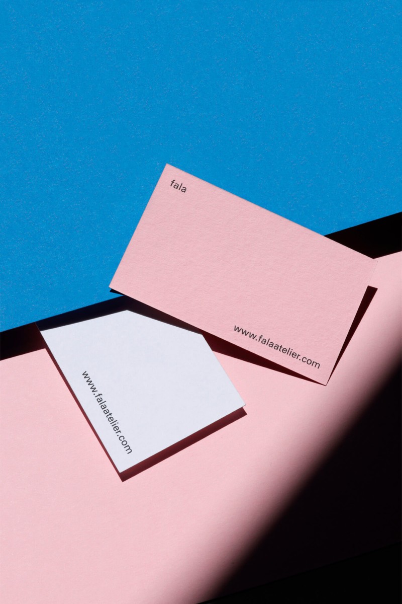
fala
- identity
- typeface
-
-
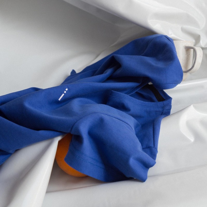
wetheknot
- identity
-
-
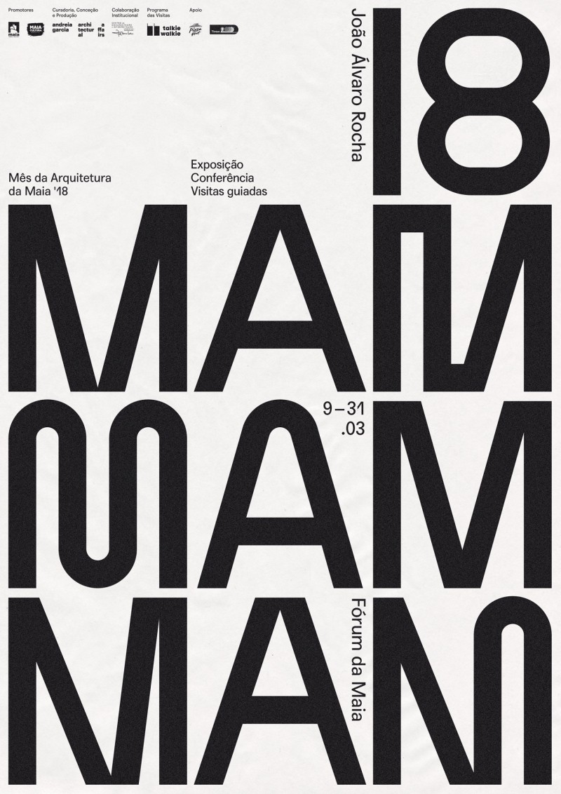
MAM '18
- identity
- campaign
- exhibition
- poster
- digital
-
-
Gallery of Architecture 18/19
- poster
-
-
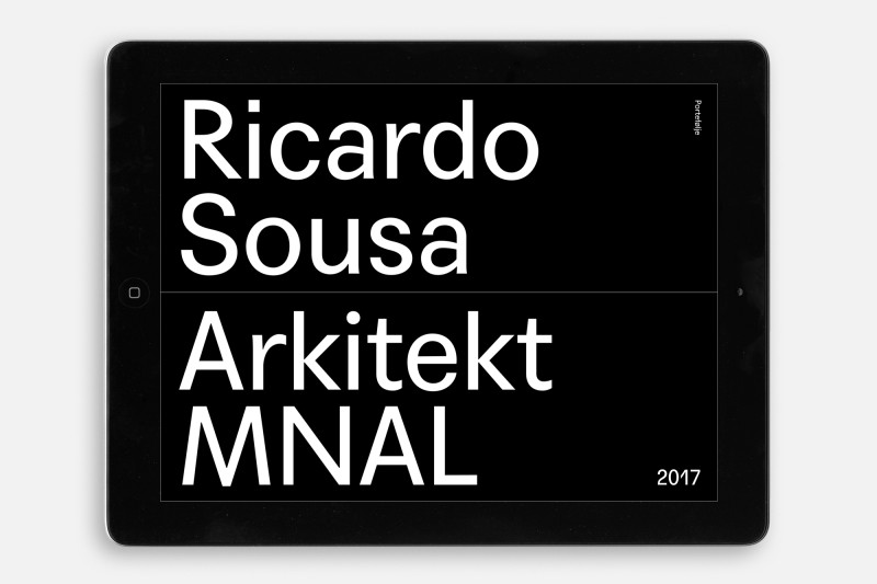
Ricardo Sousa
- poster
- digital
-
-
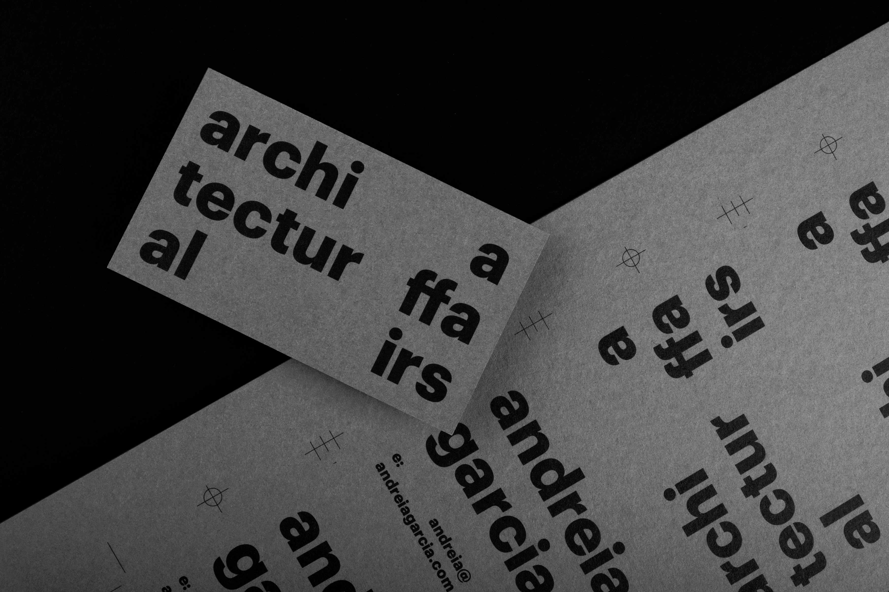
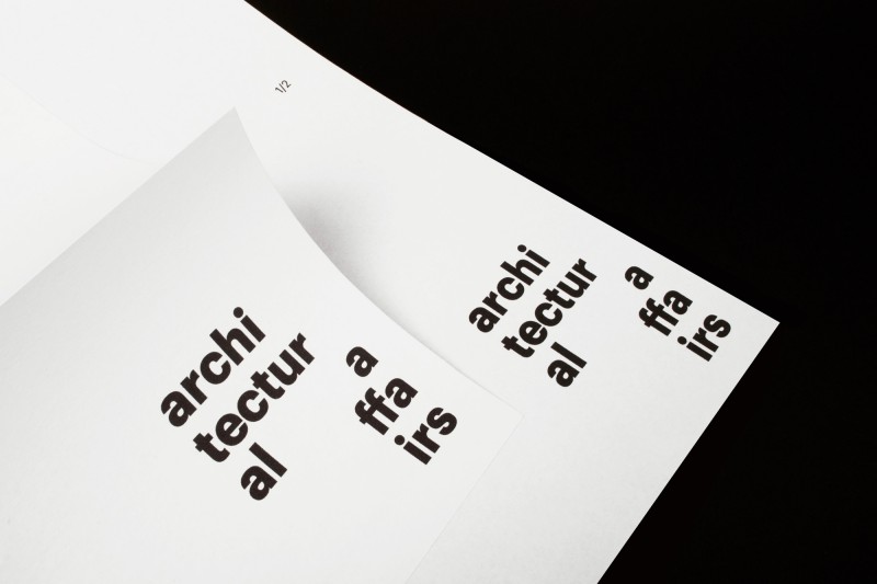
Andreia Garcia Architectural Affairs
- identity
- digital
-
-
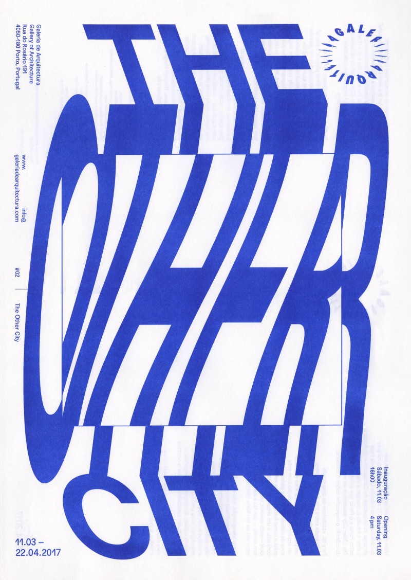
Gallery of Architecture 16/17
- poster
-
-
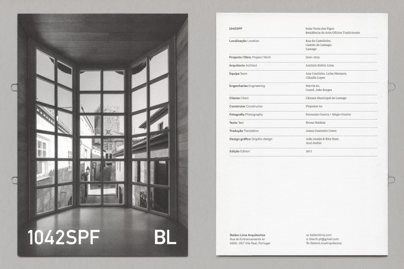
Belém Lima Booklets
-
-
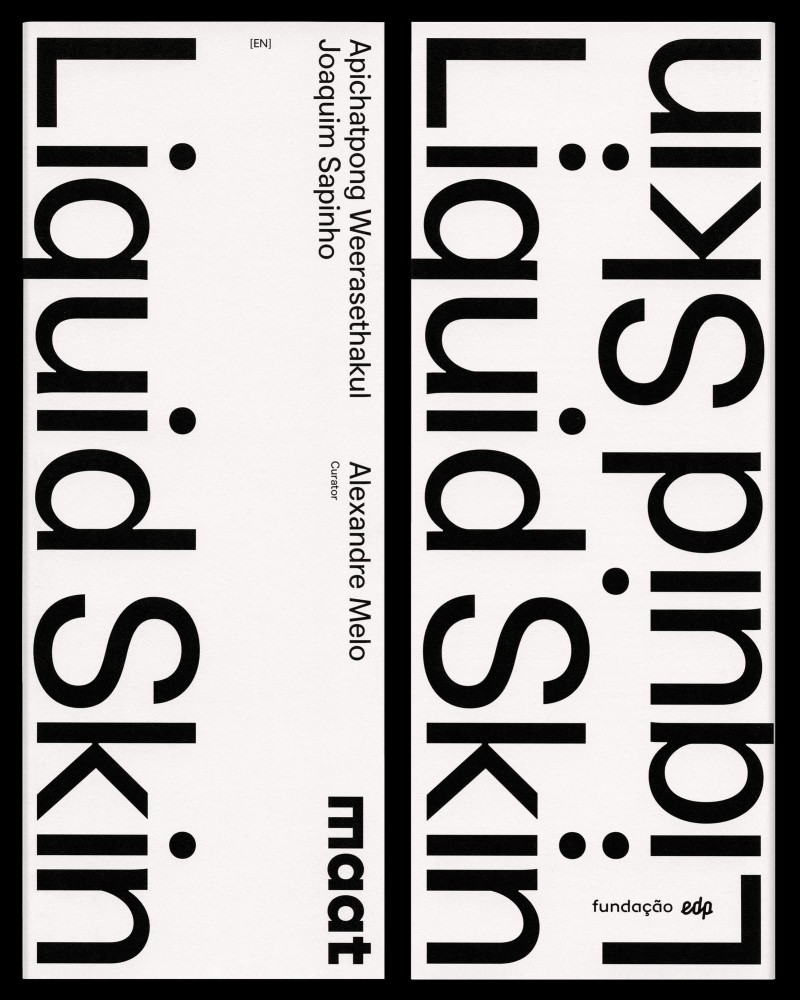
Liquid Skin
- exhibition
-
-
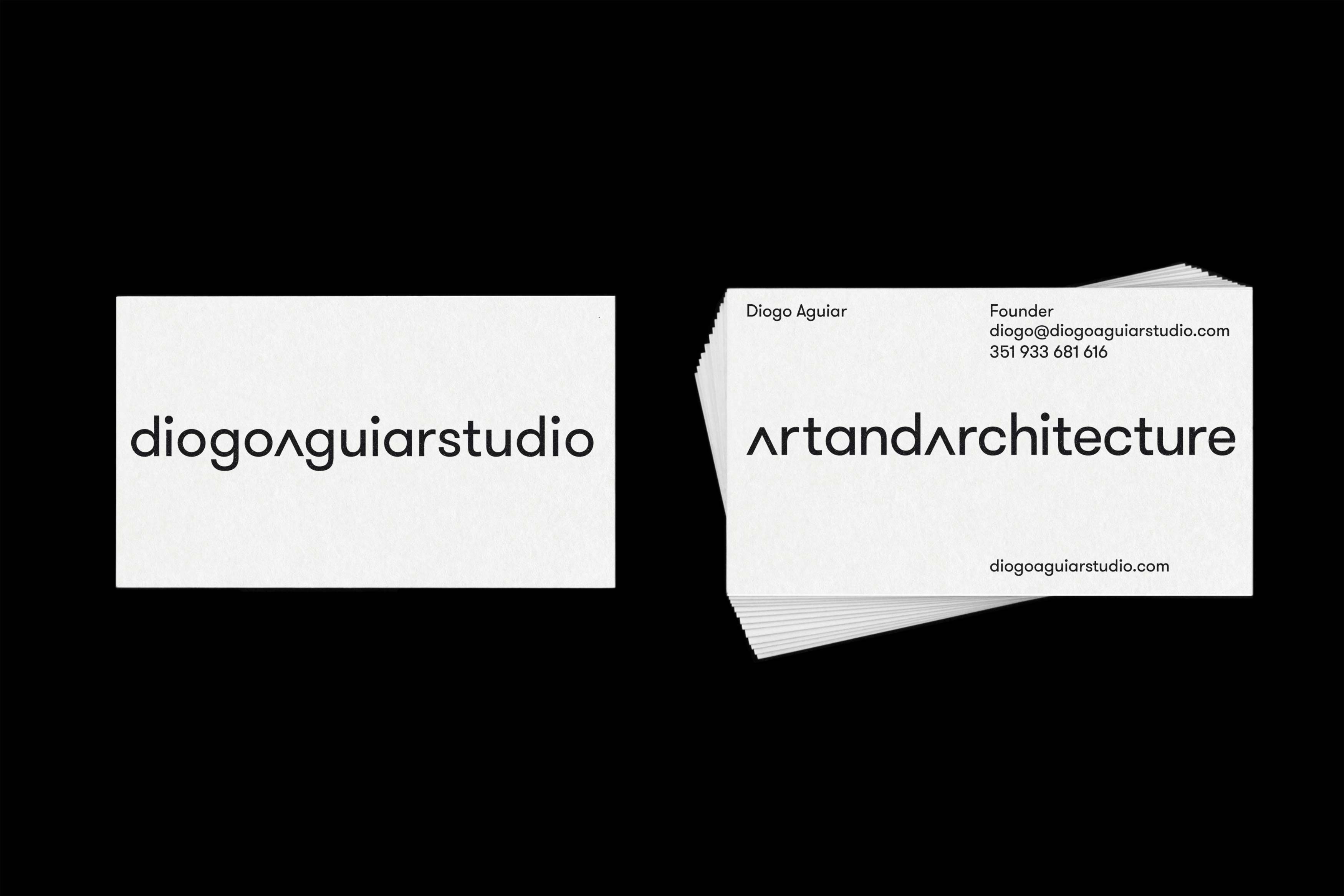
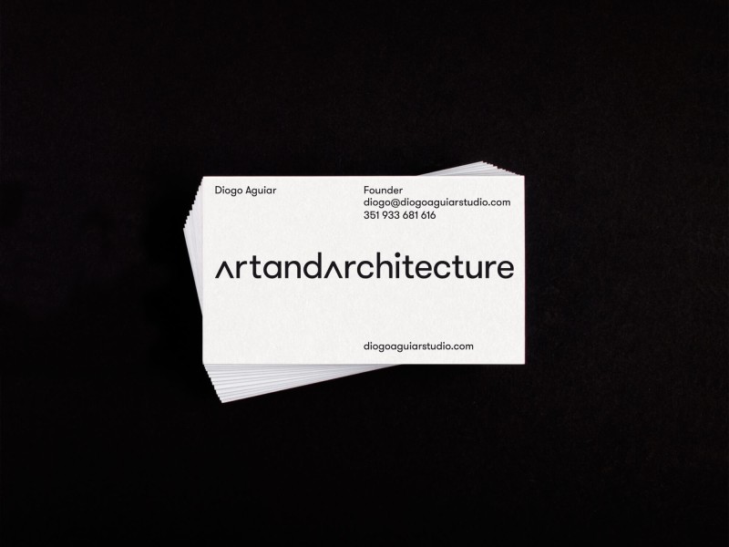
Diogo Aguiar Studio
- identity
- digital
-
-
Porto World Heritage
- publication
-
-
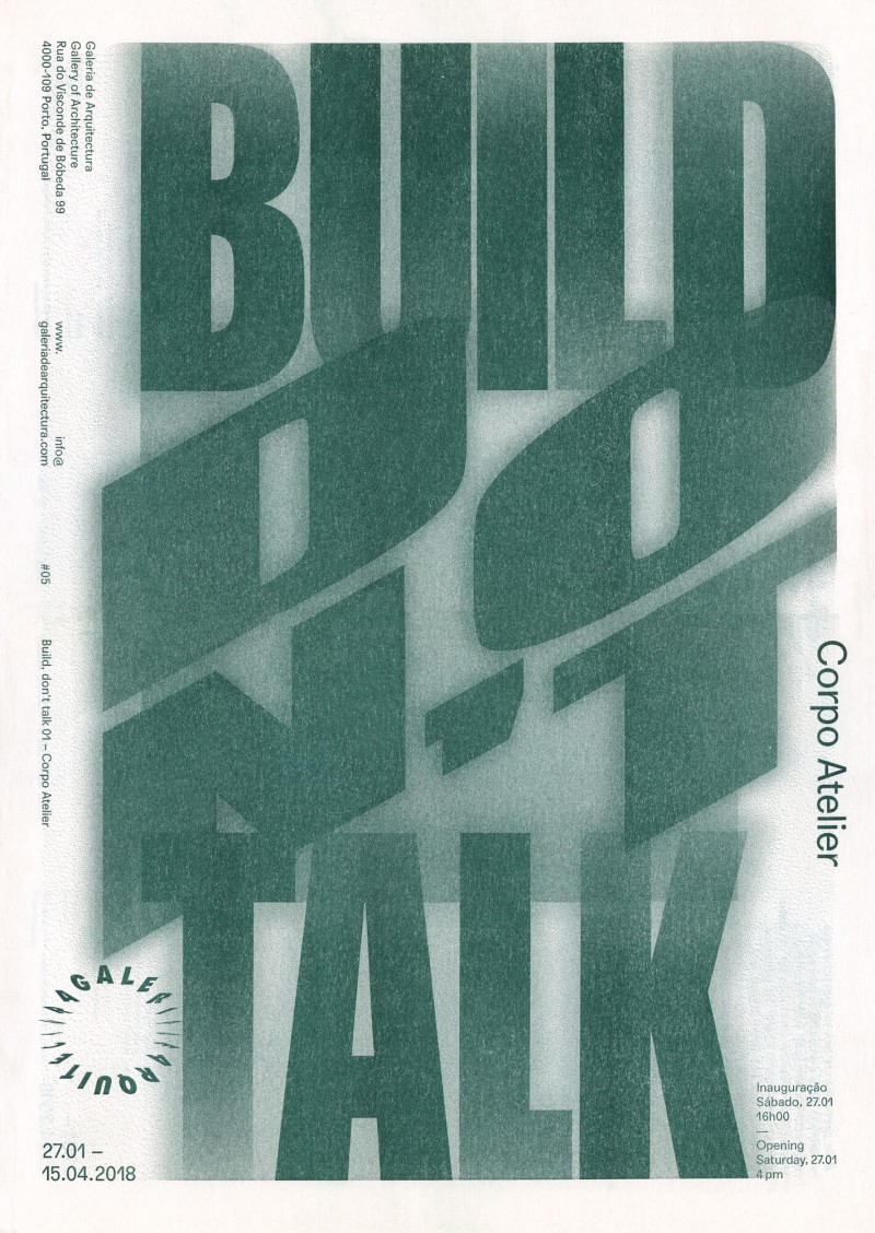
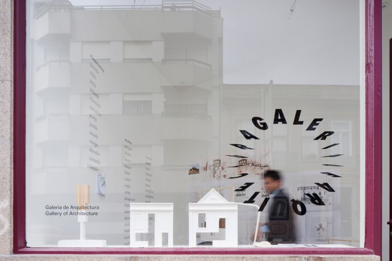
Gallery of Architecture
- identity
-
-
Mind Sets
- installation
- poster
-
-
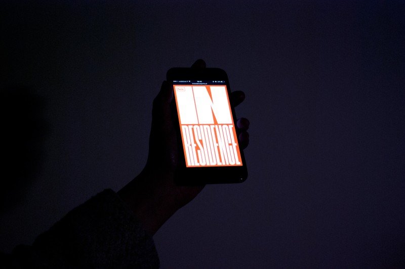
In Residence
- identity
- website
-
-
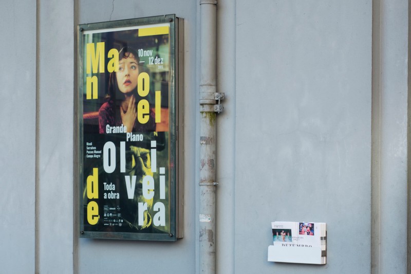
Manoel de Oliveira
- identity
- campaign
- poster
-
-
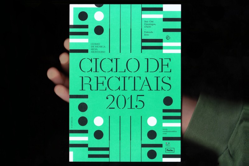
Ciclo de Recitais
- identity
-
-
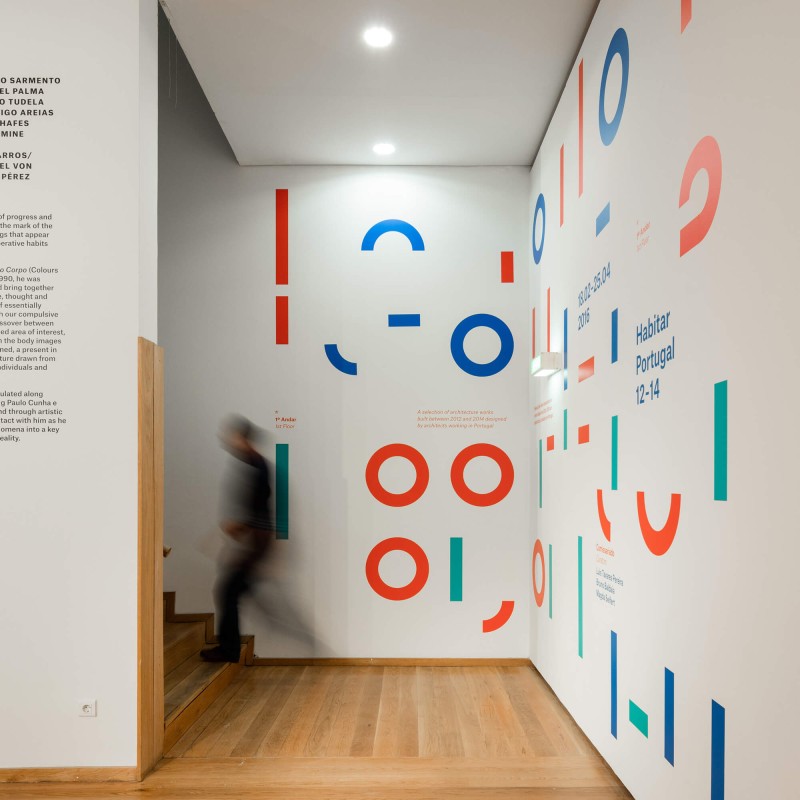
Habitar Portugal 12–14
-

João Morgado
João Morgado - identity
- campaign
- exhibition
- poster
- digital
-
-
Nartece
-
 1/3
1/3 -
 2/3
2/3 -
 3/3
3/3
- poster
-
-
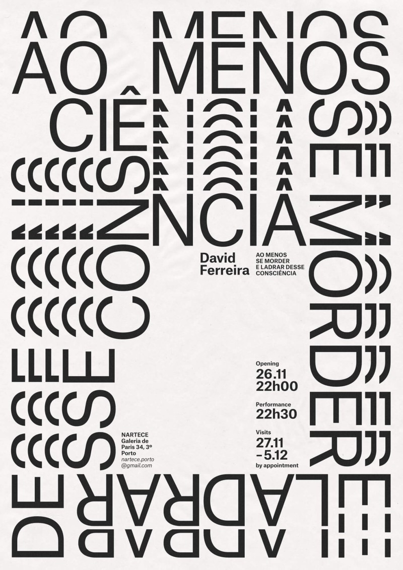
Y (why?)
-

João Drumond
João Drumond - installation
- poster
-
-
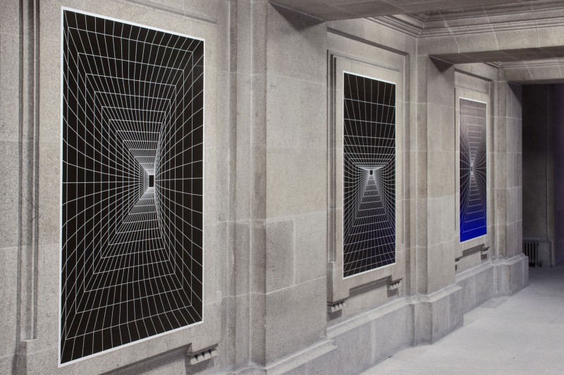
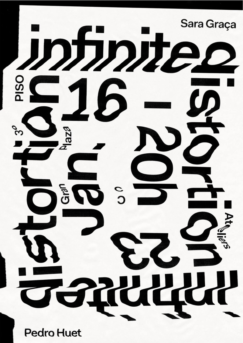
Infinite Distortion
-
 1/3
1/3 -
 2/3
2/3 -
 3/3
3/3
- poster
-
-
Calendar
-
-
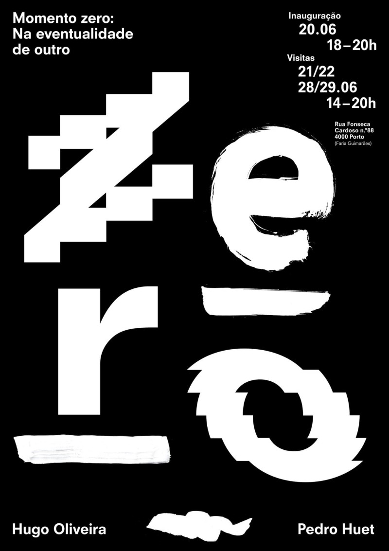
Zero
- poster
-
-
Scheiner and Sons
- installation
-
-
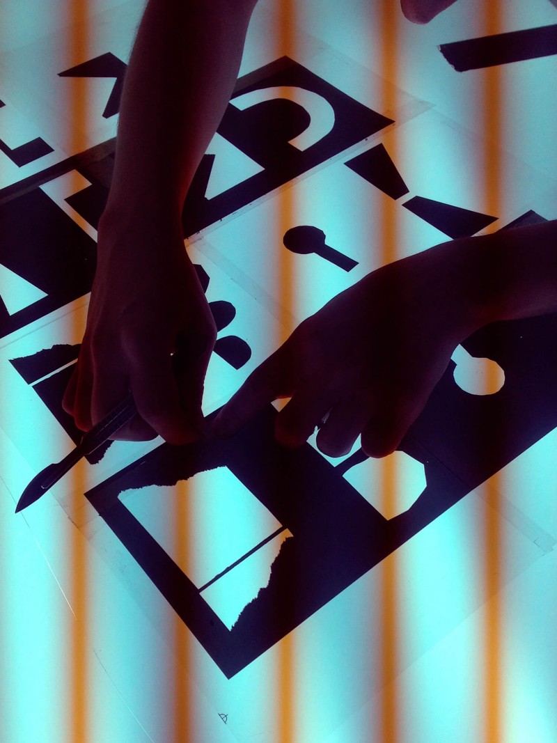
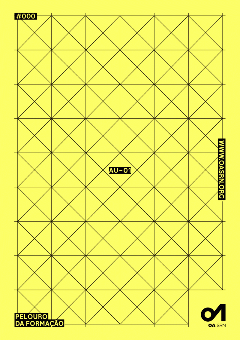
Architects Association Courses
- digital
-
-
Iberia Critica
- poster
-
-
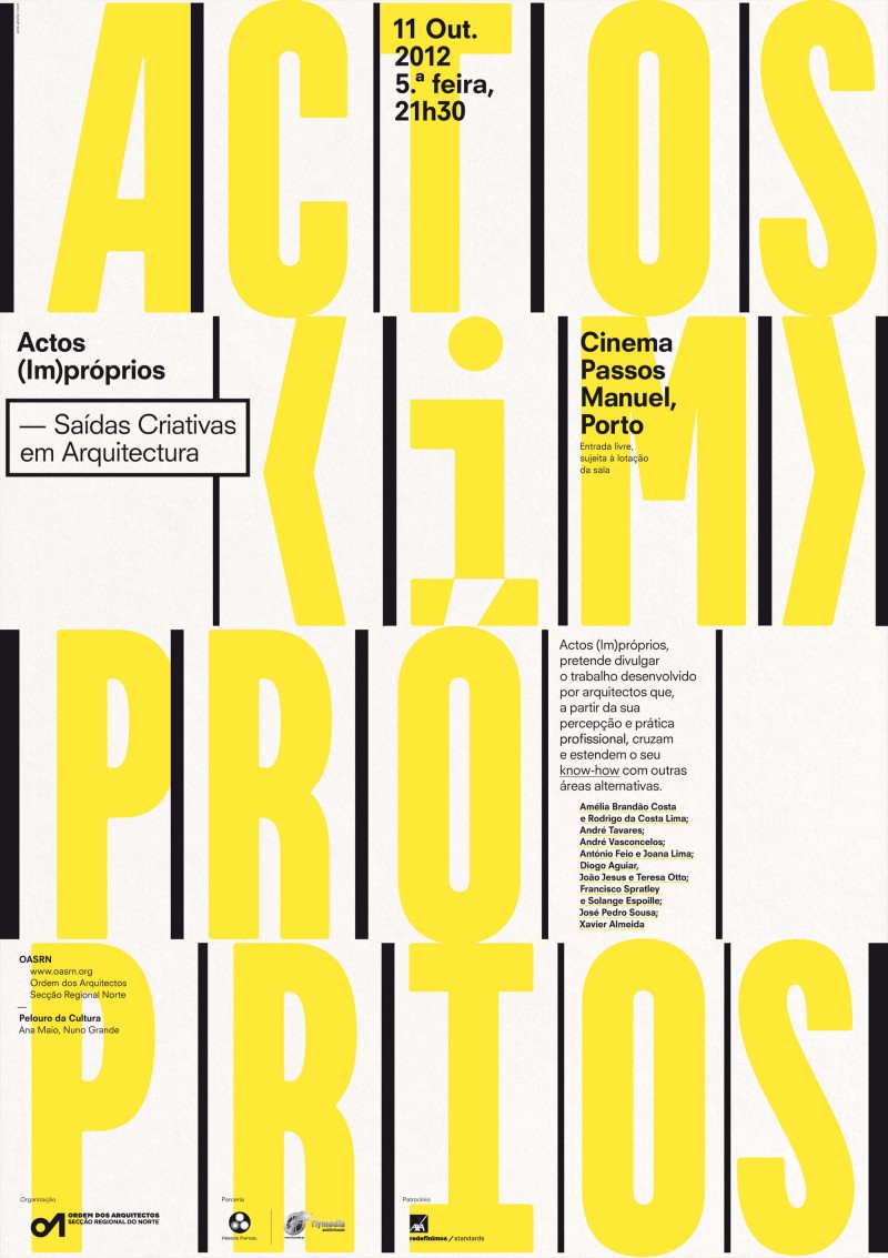
Actos (Im)próprios #2
- poster
-
-
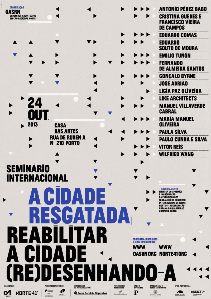
Cidade Resgatada
- poster
-
-
Actos (Im)próprios #1
- poster
-
-
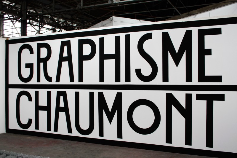
Pour Chaumont
- installation
-


-

The future is now -
pomo.pt -
Karle: Letters -
Ceci n'est pas un portrait, exhibition -
cabinet.archi -
Ceci n'est pas un portrait. -
Fertile Futures: Itinerant Laboratory -
inespimentel.com -
Figures and Fields -
Urgência da Cidade: Fernando Távora, Book -
Urgência da Cidade: Fernando Távora -
Fertile Futures Catalogue -
Assemblies of Thought -
Fertile Futures -
Novos Encontros do Cinema Português -
Eduardo Lourenço, uma vida escrita -
falaatelier.com -
Gallery of Architecture, Book -
brunoalvesalmeida.com -
Teatro do Mal -
40 dias, 40 days -

Lacerda Neto Atelier -
1961 – 1992 Japan -
Architectural Notes in Review -
Art(e)facts 21 -
Grand Tour -
fonoteca.cm-porto.pt -
Fonoteca Municipal do Porto -
Ateliers Municipais -
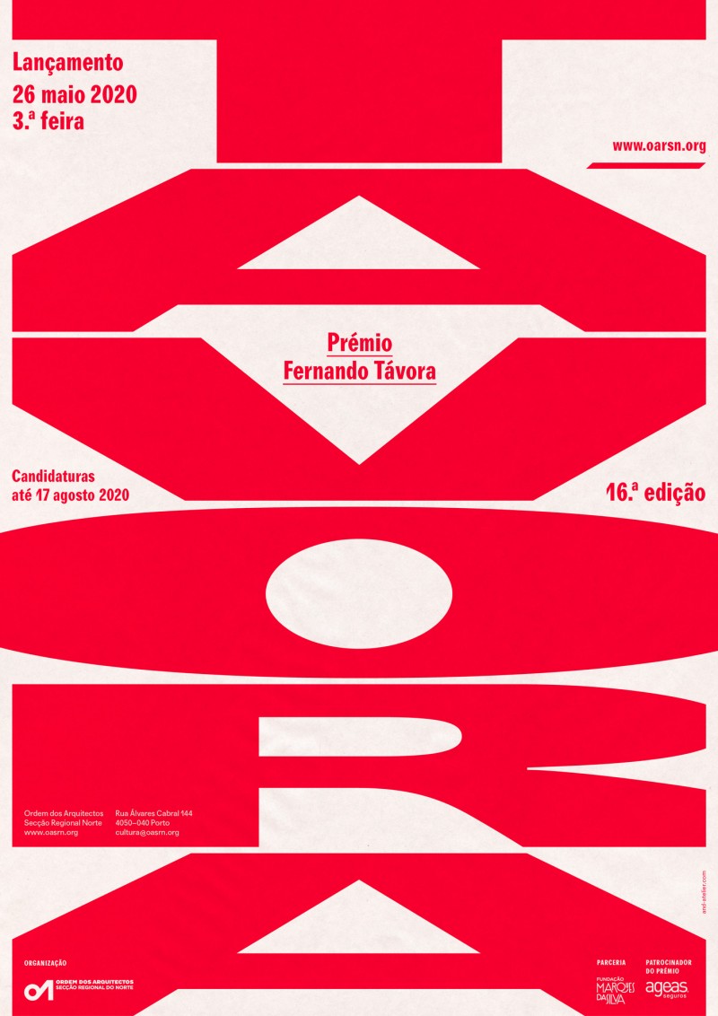
Prémio Távora -
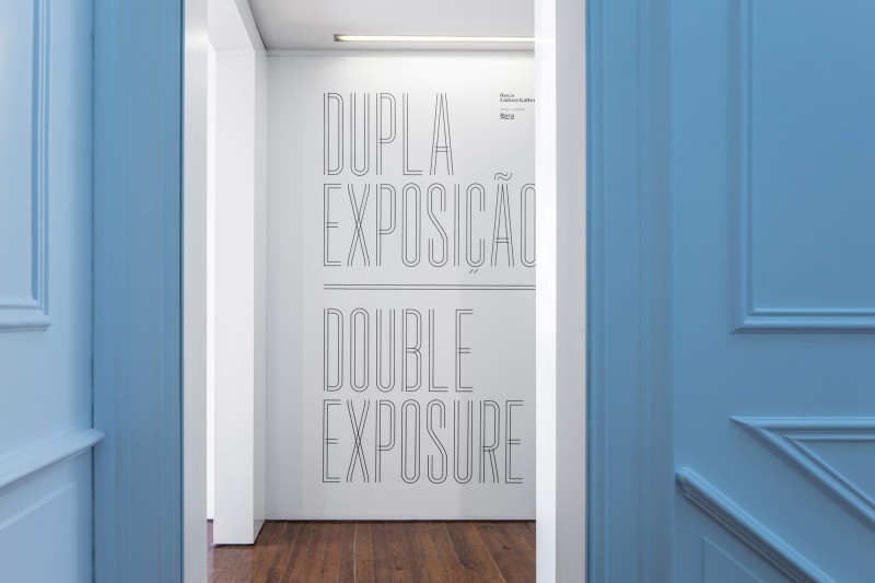
Double Exposure -
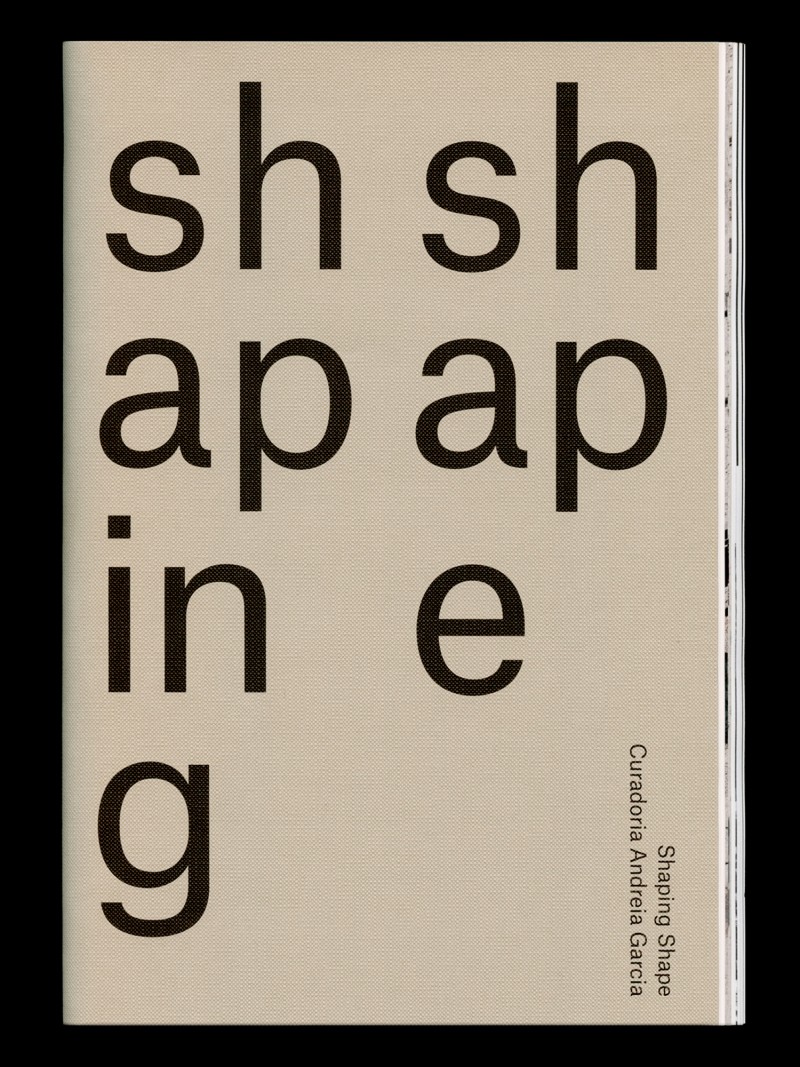
Shaping Shape -
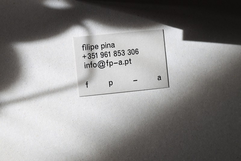
Filipe Pina Arquitectura -
Maia Biennial of Contemporary Art '19, Book -
Maia Biennial of Contemporary Art '19 -
MAM '19 -
Academias Gulbenkian Conhecimento -
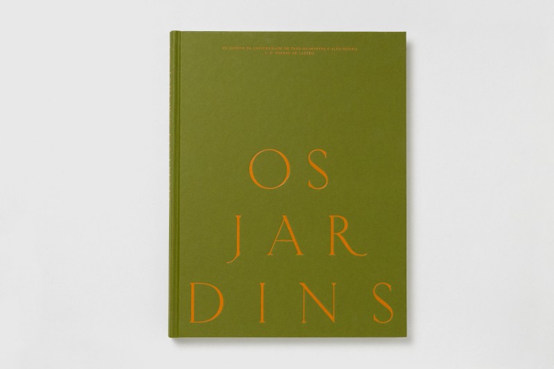
Os Jardins da UTAD -
fala files -
fala -
wetheknot -
MAM '18 -
Gallery of Architecture 18/19 -
Ricardo Sousa -
Andreia Garcia Architectural Affairs -
Gallery of Architecture 16/17 -
Belém Lima Booklets -
Liquid Skin -
Diogo Aguiar Studio -
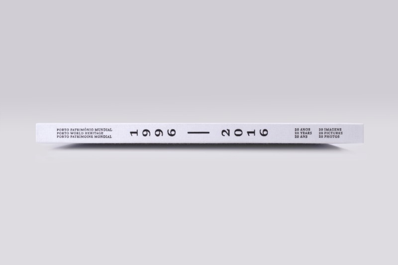
Porto World Heritage -
Gallery of Architecture -
Mind Sets -
In Residence -
Manoel de Oliveira -
Ciclo de Recitais -
Habitar Portugal 12–14 -
Nartece -
Y (why?) -
Infinite Distortion -
Calendar -
Zero -
Scheiner and Sons -
Architects Association Courses -
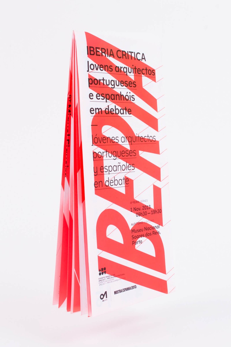
Iberia Critica -
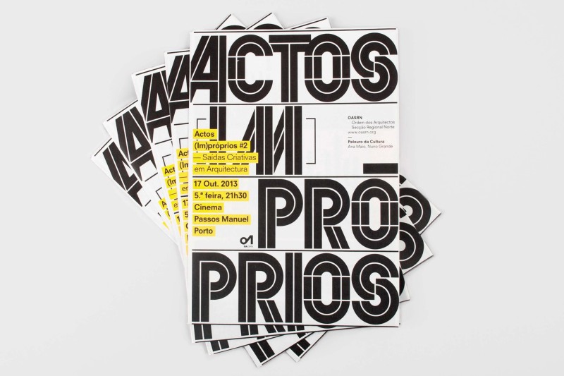
Actos (Im)próprios #2 -
Cidade Resgatada -
Actos (Im)próprios #1 -
Pour Chaumont