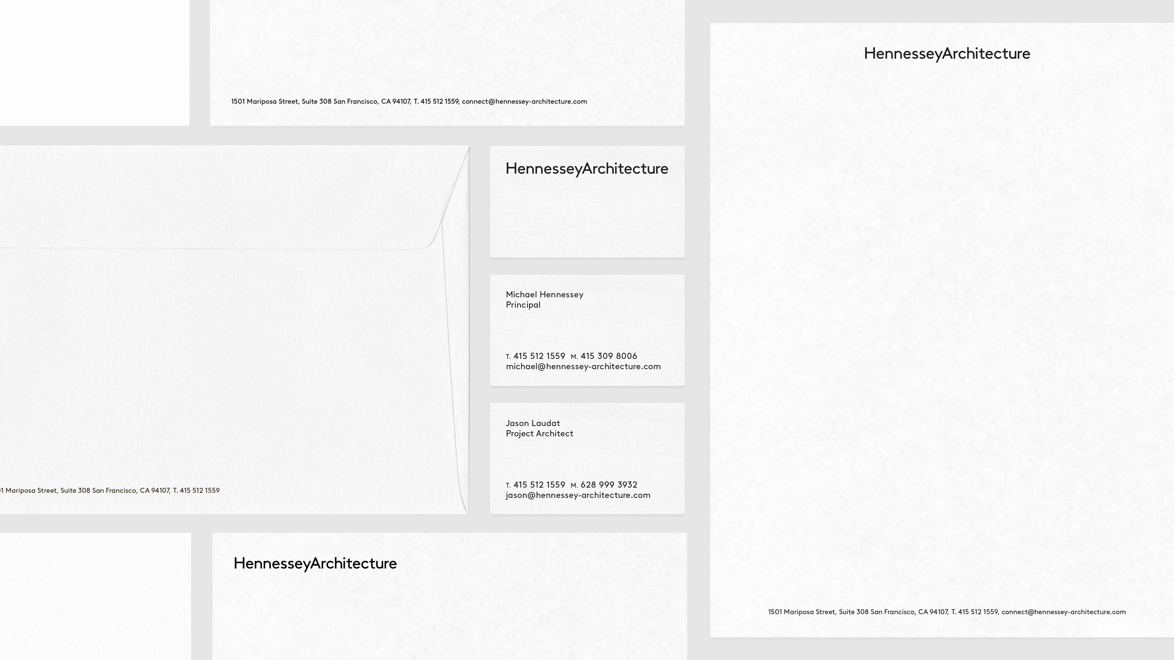
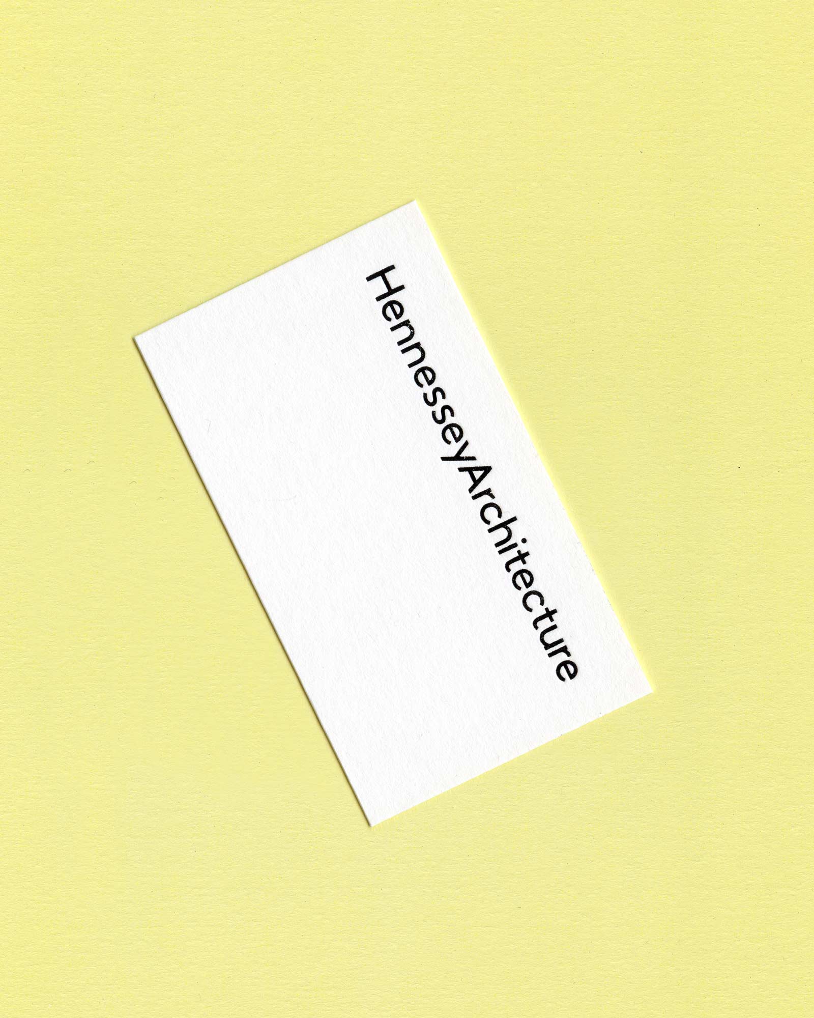
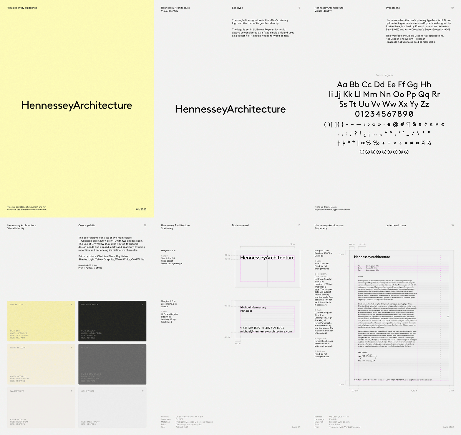
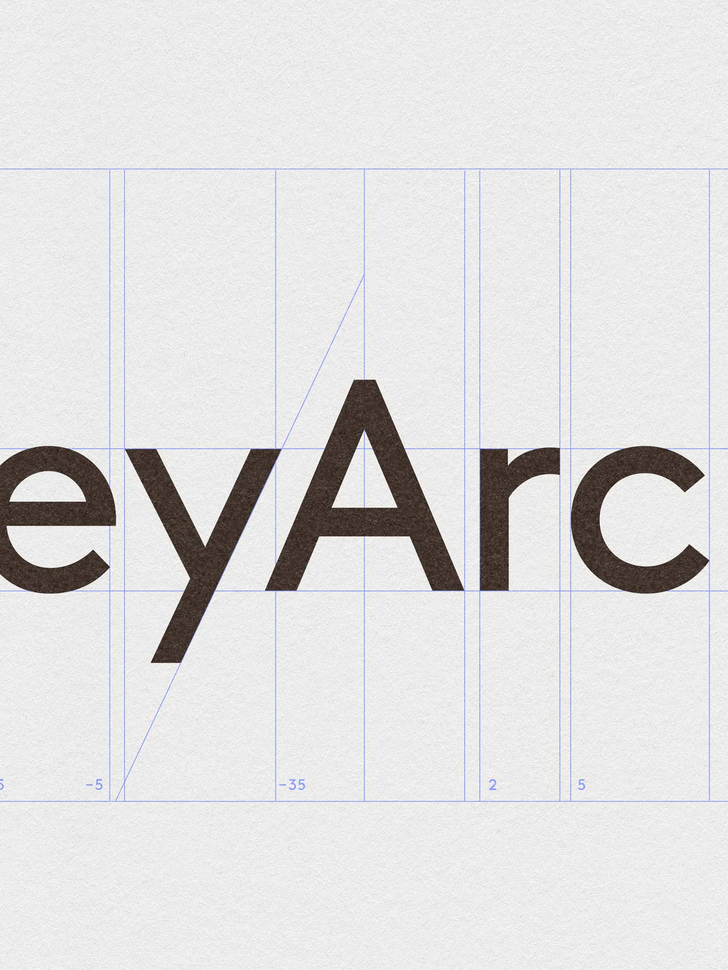
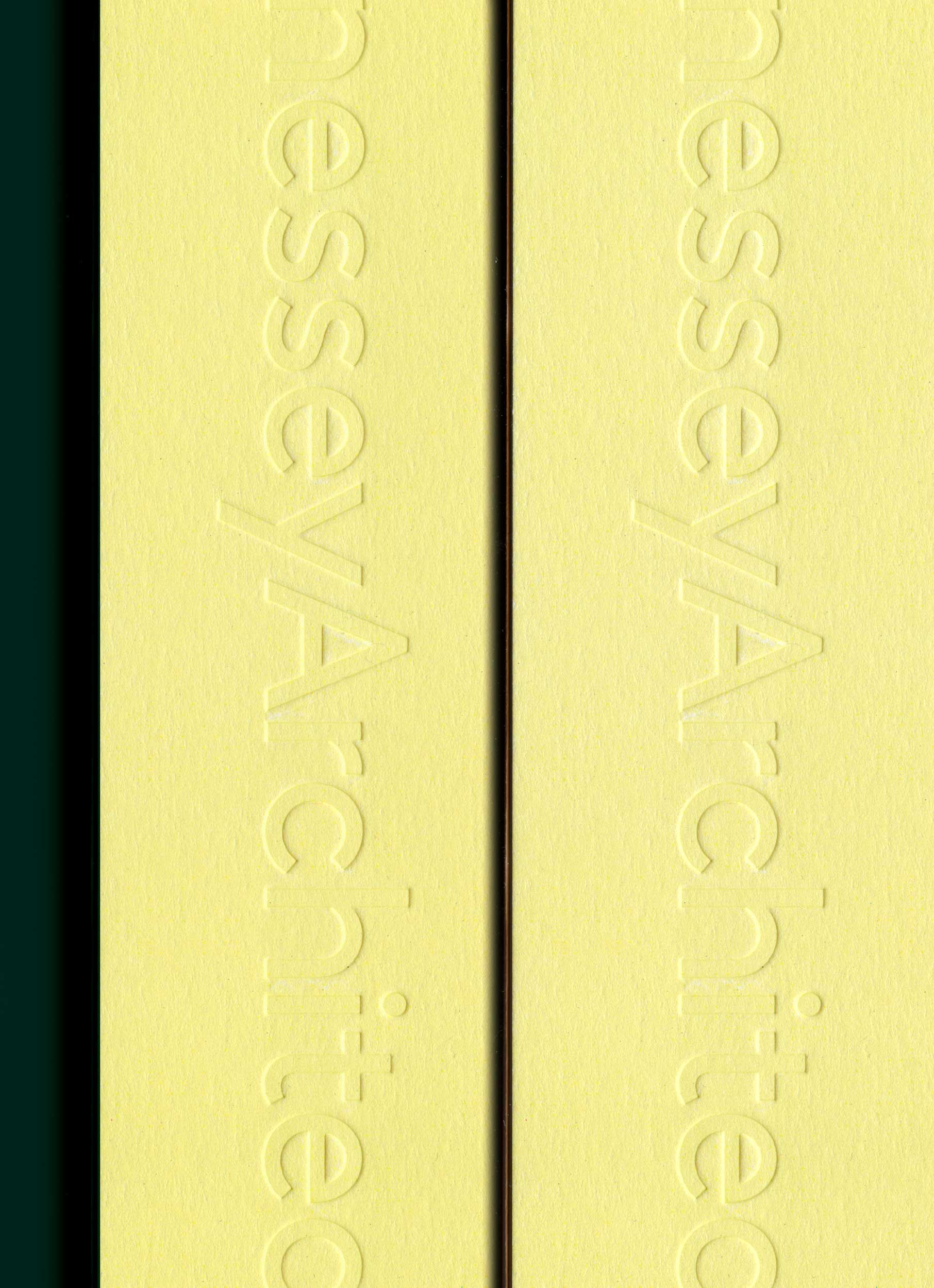
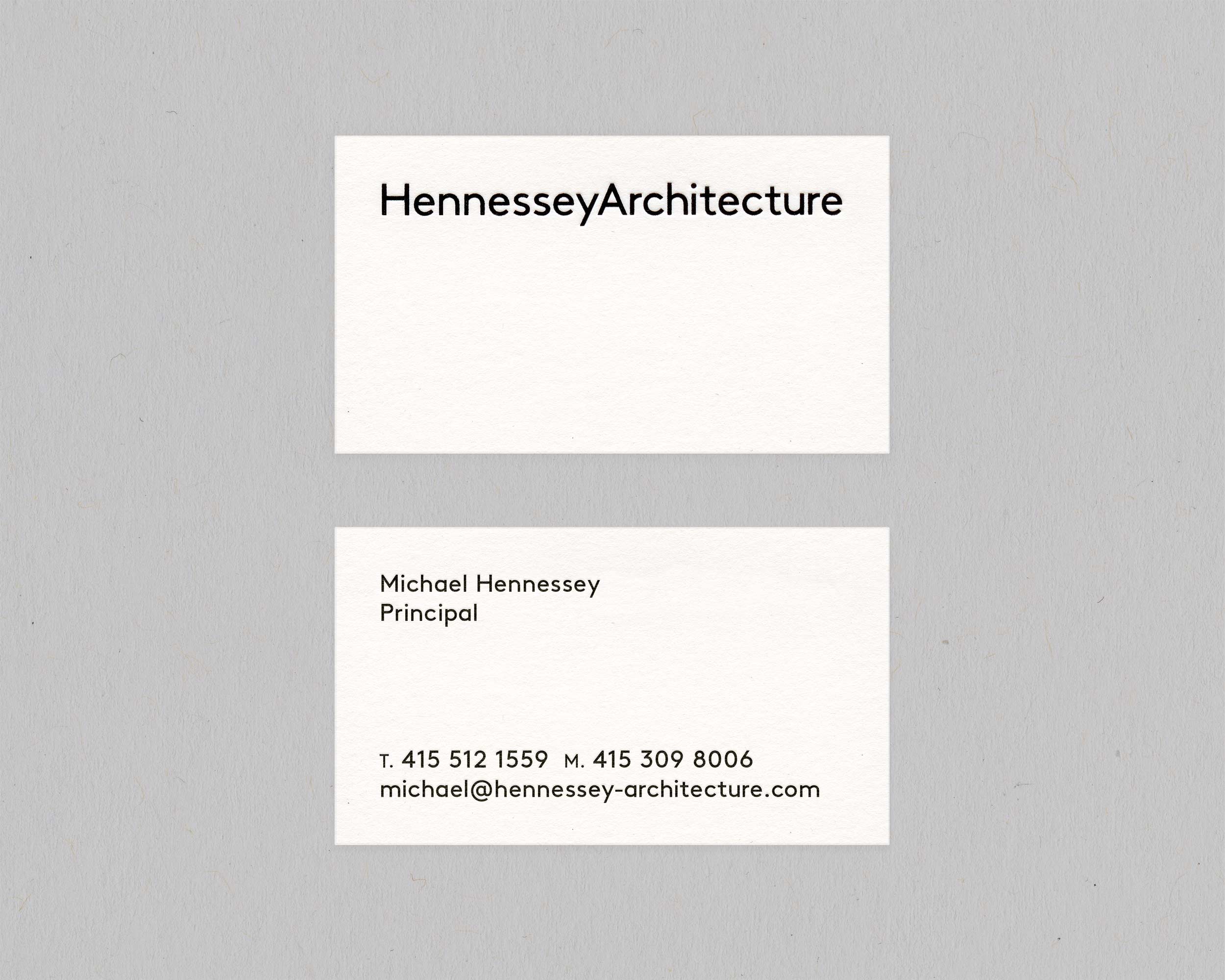
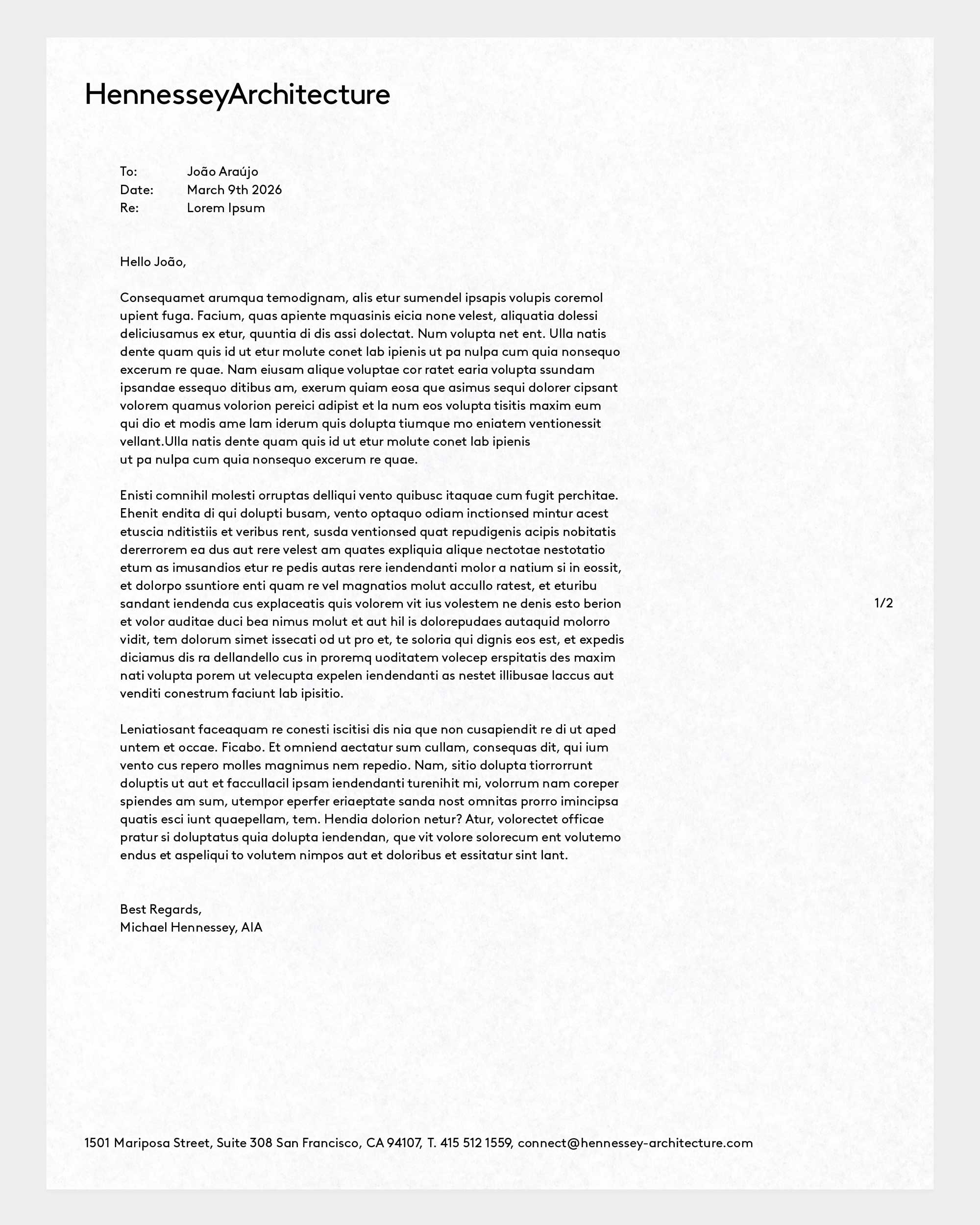
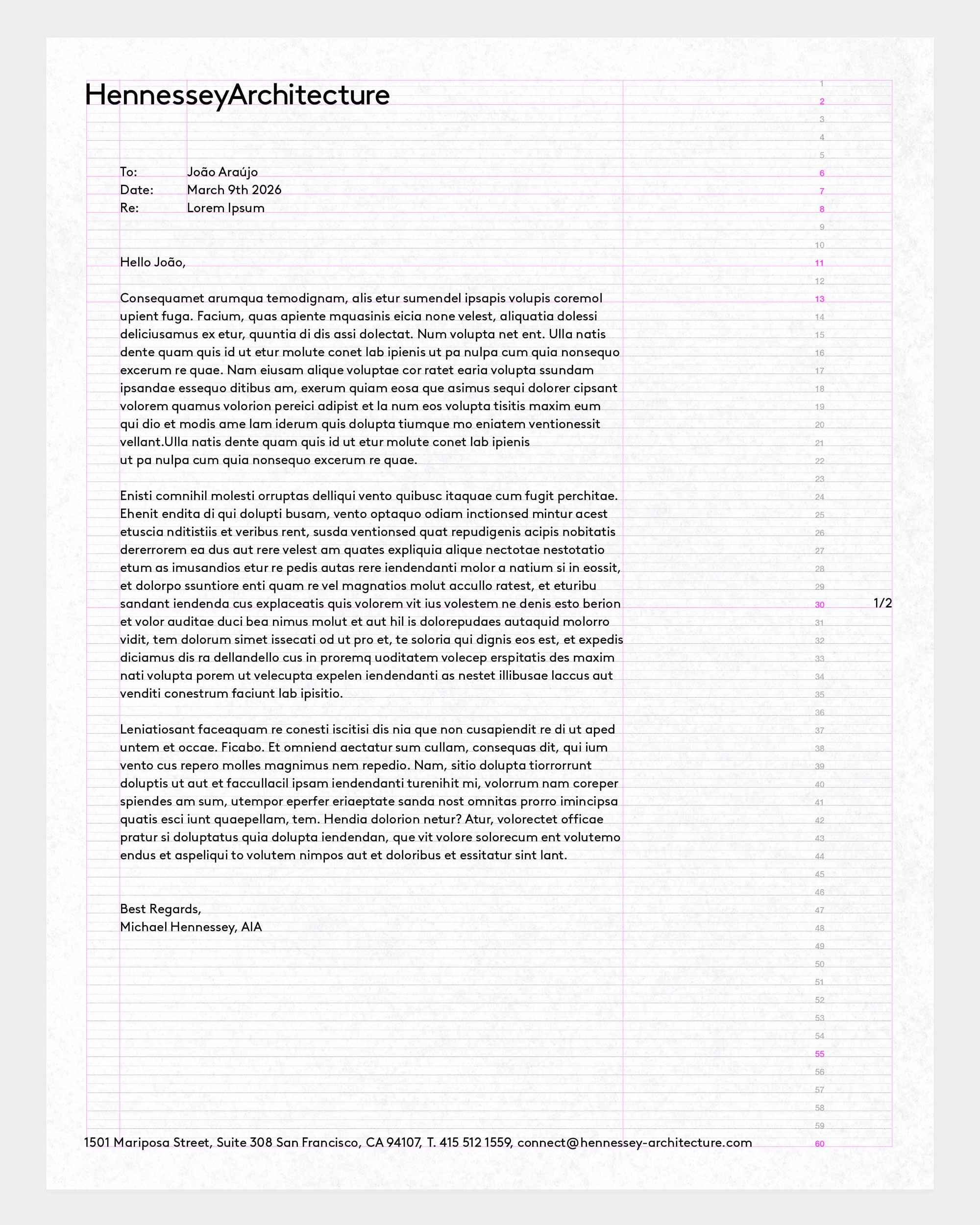
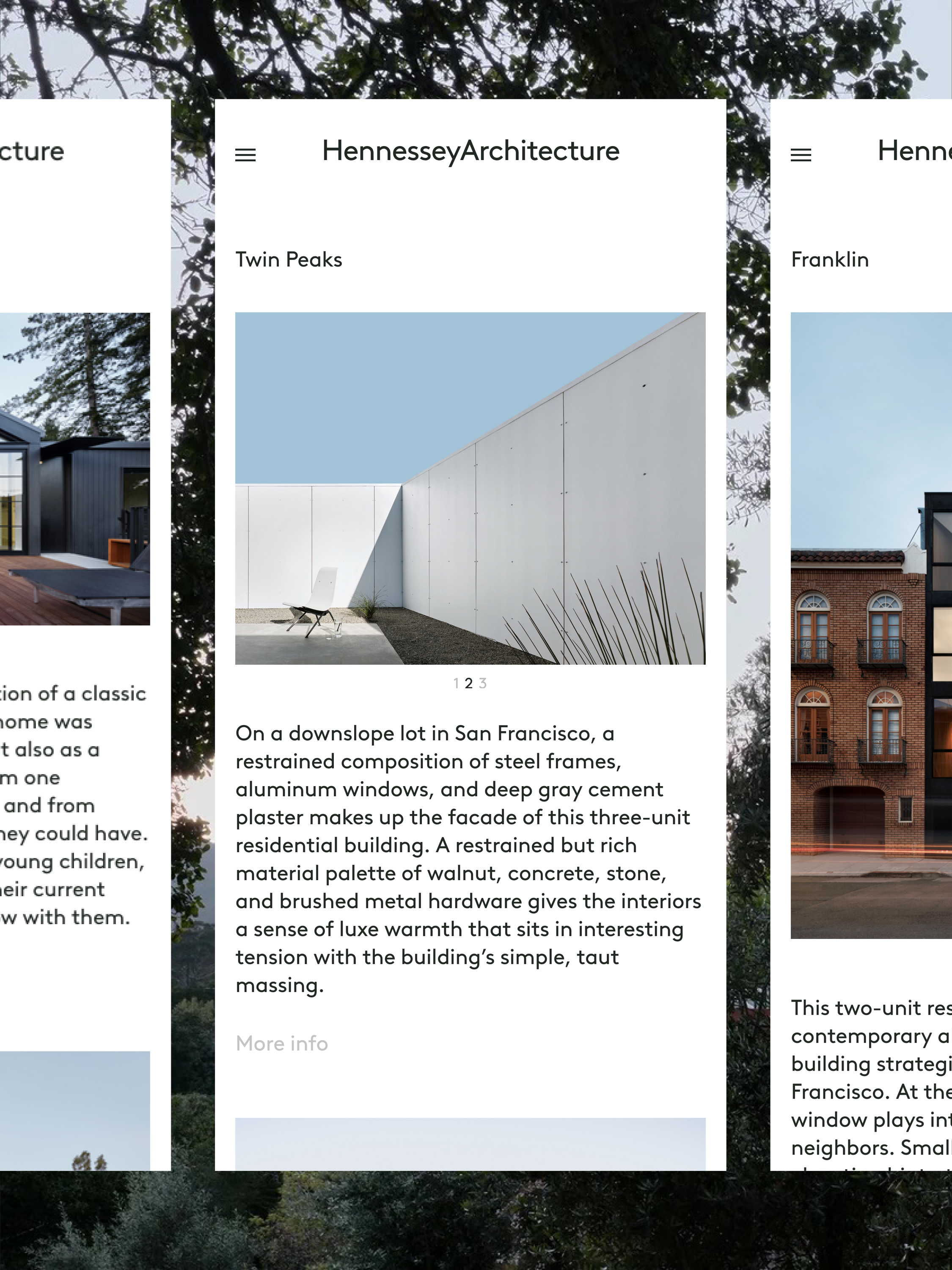
Hennessey Architecture is a San Francisco based architecture office founded by Michael Hennessey. Built around two words of similar length, the main logo/signature explores the relationships that arise from their continuous flow. The geometric sans-serif typeface, LL Brown, emphasizes the specificities and architecture of both words, allowing graphic rythms to unfold: the double ‘nn’ and ‘ss’, the five ‘e’s. At the exact center of the composition, the sharp triangular geometry of the uppercase A punctuates the transition between the two words, simultaneously attracting and opposing them, while creating a strong visual bridge with the foundational and orthogonal, uppercase H, and with the disruptive and oblique, lowercase y. Hennessey Architecture's visual identity is rooted in typography and the written word as structural and foundational elements of the office's name and identity.